How to Find and Pick Reference Photos for Photorealistic Car Drawings
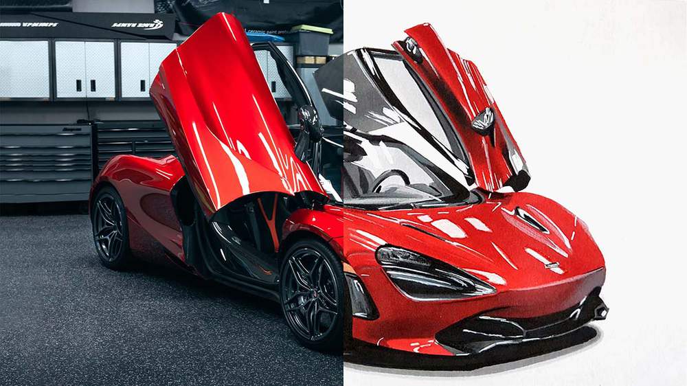
Table of Contents
If you want to make a realistic drawing of a car you NEED to use reference photos.
Drawing a car realistically is quite a complex thing to do. You need to make sure the proportions of the car are realistic, the paint color behaves naturally and realistically, the reflections look like they could be real, the window looks transparent while having reflections partly covering it, etc.
This is too much to draw completely from memory, especially when you're new to this. Even after a decade of drawing cars, I still find it very difficult to draw realistic cars from scratch.
By using reference photos, you can see how these aspects
work and behave on a real car and make them work in your drawing. I like
to use multiple reference photos and combine them into 1 drawing.
This
approach allows me to select and combine photos that highlight
different aspects of the car I want to include, like nice reflections, a
beautiful color, the angle and proportions of a car, etc. Those are
often the 3 types of reference photos I use to create a drawing, but you
can use as many as you like for as many other aspects of a car as you
want.
Kinds of Reference Photos
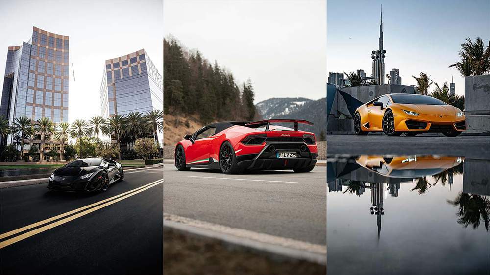
As I mentioned before I like to use reference photos for the proportions and angle of the car, the paint color, and the reflections. Those are the 3 types I use.
However, you can also use reference photos for specific details (like emblems and headlights), lighting and shadow (I often combine this one with the reflections), motion blur (like a car driving on a track with the background and the wheels blurred), the background, and so on.
I am very specific when it comes to finding
the right reference photos for my drawings. Here's exactly what I look
for when searching for reference photos for my car drawings.
1. Reference for Perspective/Angle and Proportions
Minimal Perspective Distortion
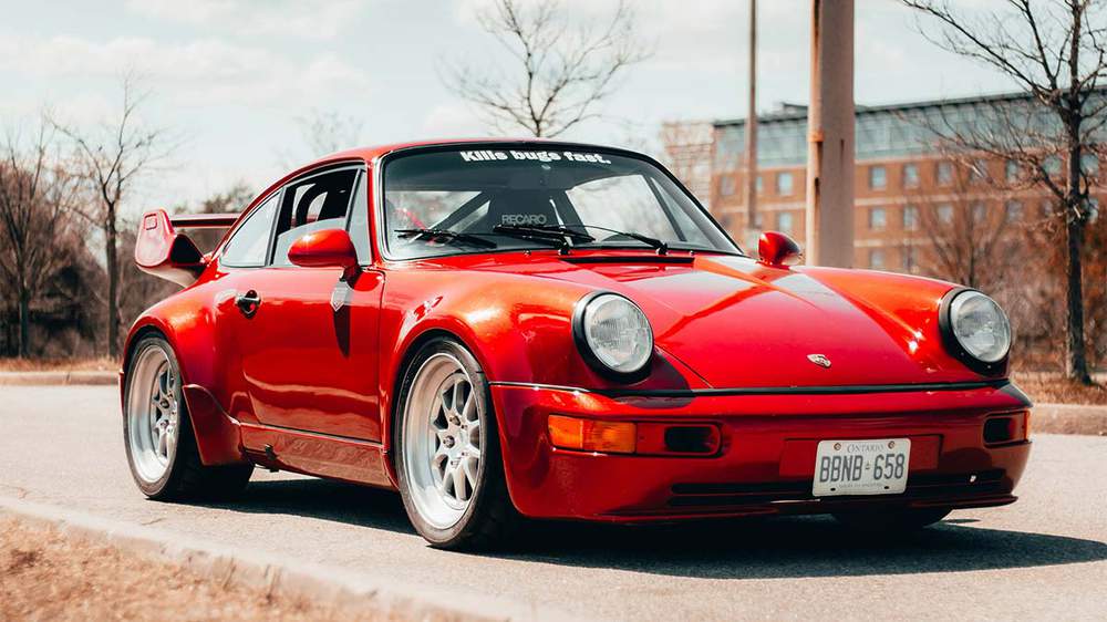
When looking for a reference photo for the angle, I always look for images that have minimal perspective distortion. In my opinion cars (and drawings of cars) look a lot better if there isn't that much distortion.
If you're not sure what perspective distortion is, here's a short explanation.
What is Perspective Distortion?
Perspective distortion happens when parts of a car look out of proportion in a photo. This usually occurs when the photo is taken from very close or with a wide-angle lens.
In car images, this can make the front of the car look much larger than the back if photographed from a low angle close to the bumper. Similarly, a high-angle shot can make the roof look too big compared to the wheels.
Effects of Perspective Distortion:
- Exaggerated Features: The part of the car closer to the camera looks bigger.
- Altered Proportions: The car's shape can look unrealistic.
- Dramatic Angles: Can create a misleading view of the car's size and shape.
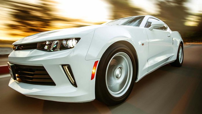
I severely dislike photos of cars with much perspective distortion, so I try to look for images with little distortion.
Here's how to see if a photo has much distortion (if it isn't already obvious):
If I'm looking for a front/side view of a car I check if the rear wheels aren't too much smaller than the front wheels (or vice versa). If there is a big difference, that means that there is a lot of distortion going on.
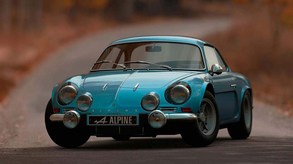
Photo by ALEXGTACAR from Pexels: https://www.pexels.com/photo/shallow-focus-photography-of-blue-alpine-car-1592384/
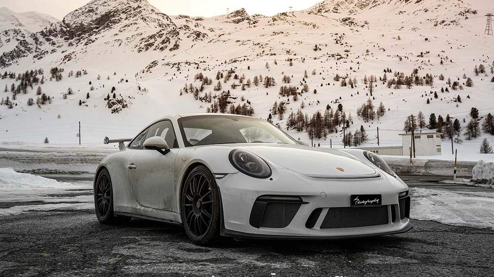
And if I'm looking for a top-down view at an angle, I make sure that the rear isn't too much narrower than the front (or vice versa). If that's the case, there is a lot of distortion happening.
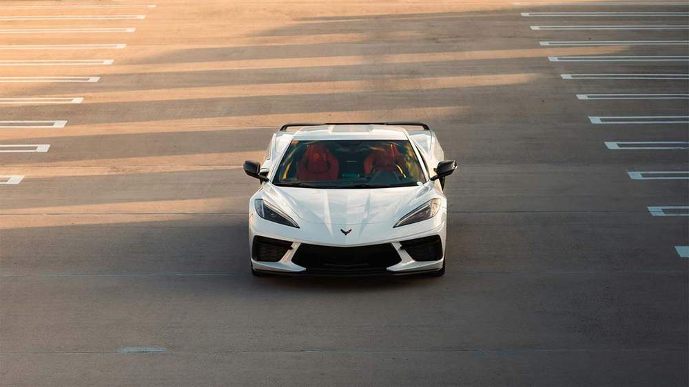
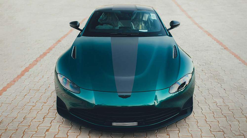
Photo by Mohit Hambiria from Pexels: https://www.pexels.com/photo/aston-martin-vantage-v8-f1-edition-20435116/
Those are the main ways I check for perspective distortion.
An Interesting Angle of the Car
What makes an angle interesting?
First off, let's answer the question: what makes an angle boring? This is a way easier question to answer.
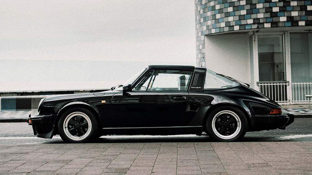
In my opinion perfect side, front, and rear views are boring. As you only see 1 side of the car there isn't a lot of depth and I like depth a lot.
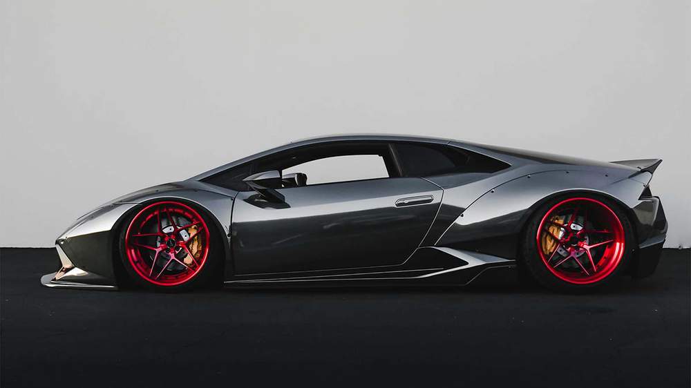
However, if the lighting is good and the reflections look interesting, then it can still have a lot of depth and look good. But since I can choose what to draw, I'll just avoid these angles.
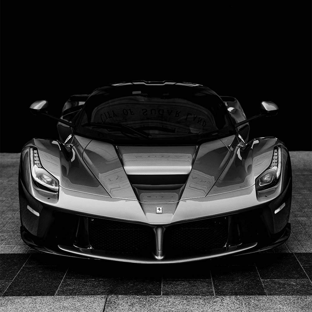
I do however like front and rear views when they are not perfectly straight from the front but a little from above as this shows more depth.
Now back to the first question: what makes an angle interesting?
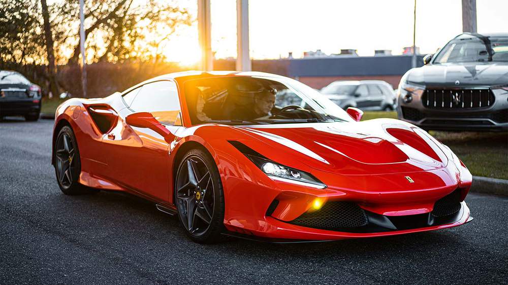
A more dynamic pose makes a car angle more interesting to me. Examples of this are 3/4 front view and rear view angles, and unusual angles.
3/4 front view and rear view are the angles I draw most often as it's easier to find good reference photos for them.
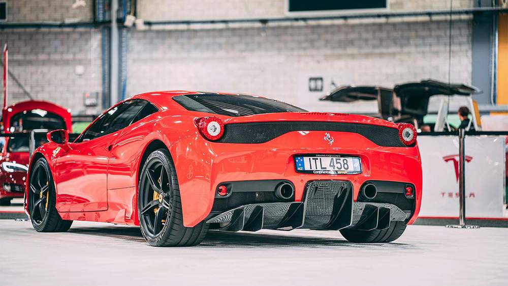
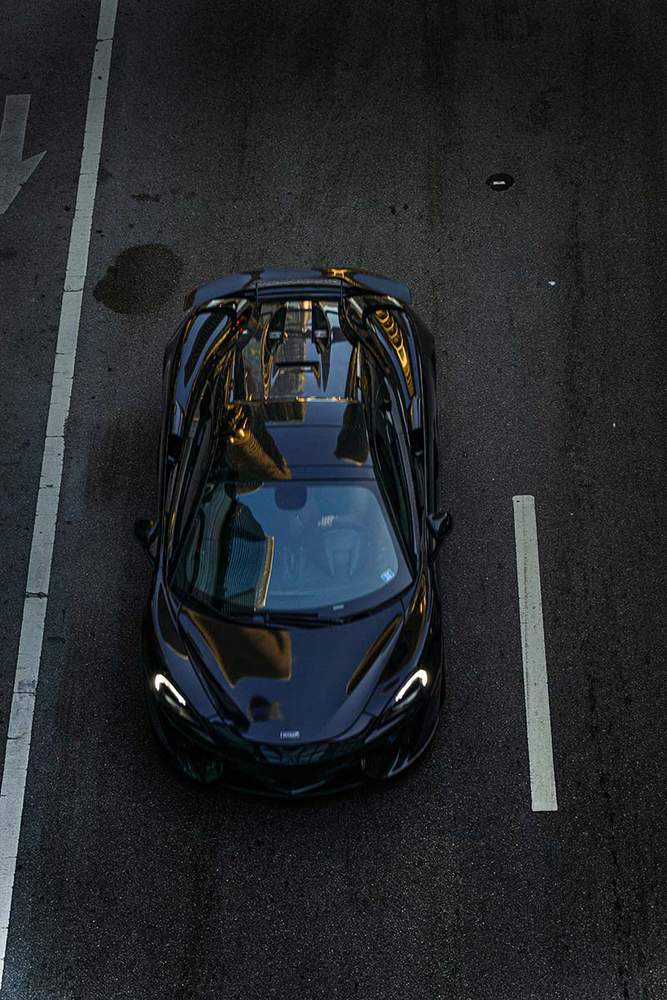
However, sometimes I come across a photo of the car I want to draw at a very unusual angle, an angle that you wouldn't normally see if you were looking at the car. An example of this is top-down views.
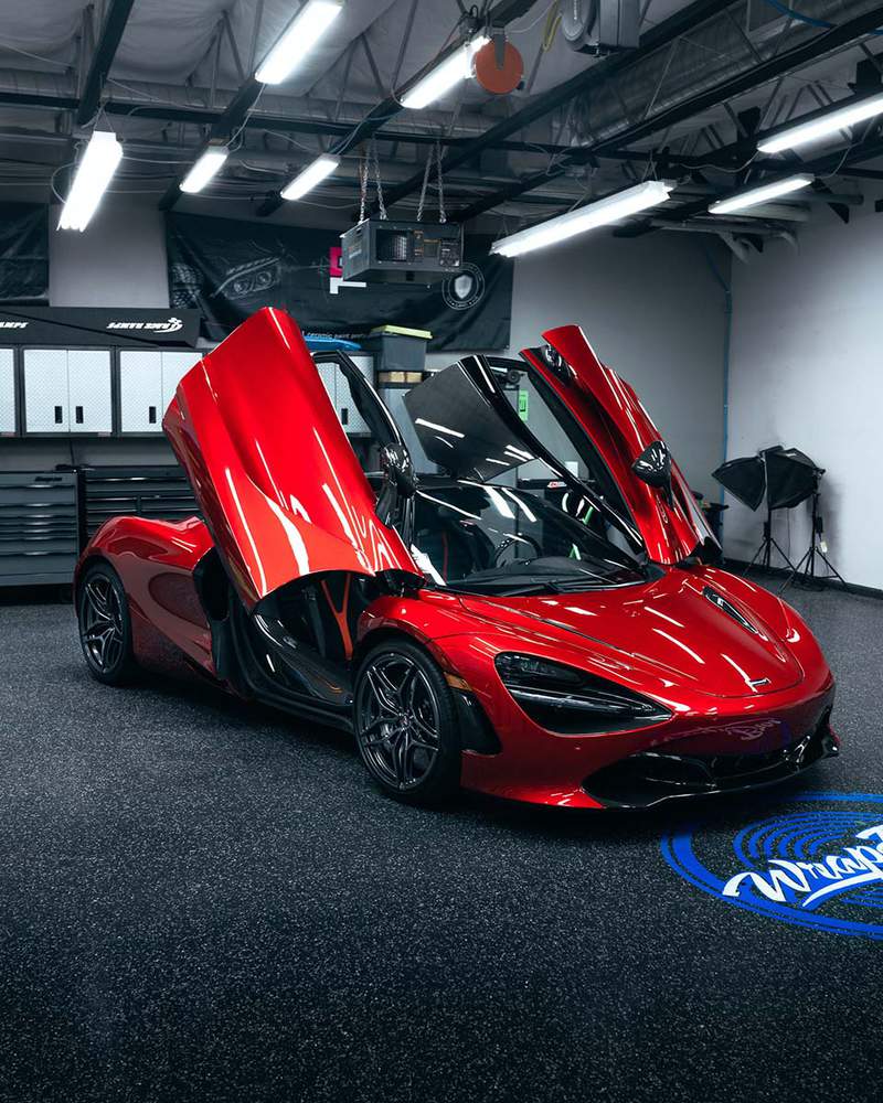
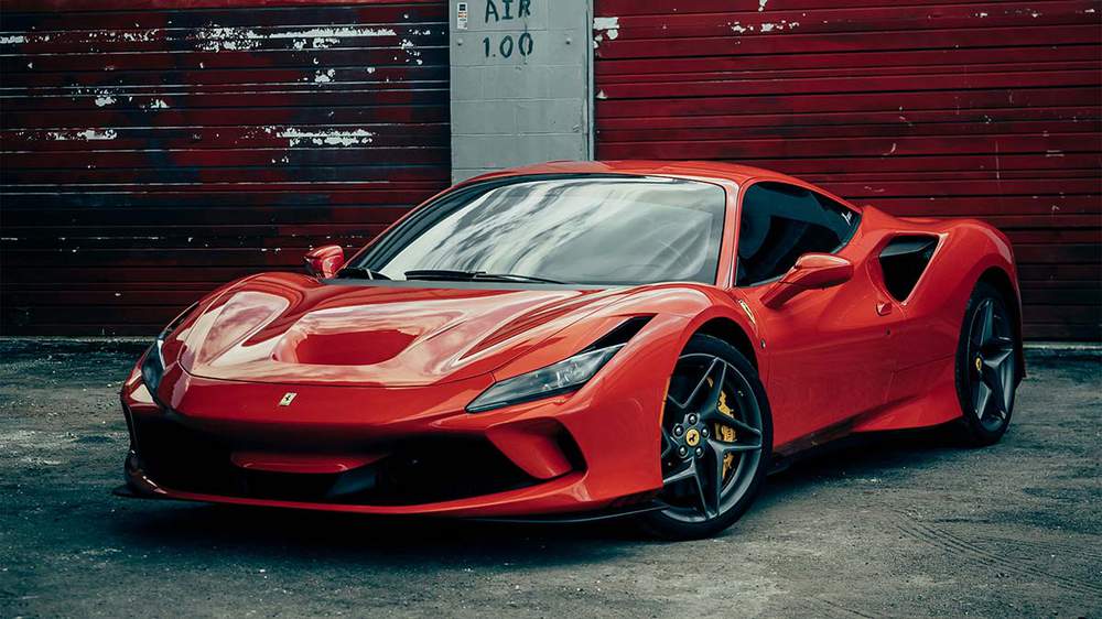
More
things that make an angle more dynamic are when cars with butterfly or
gullwing doors have their doors open, and when the front wheels are
turned a bit.
These are not necessary for me, but they can make the car angle more interesting.
The Car Fits the Paper Well
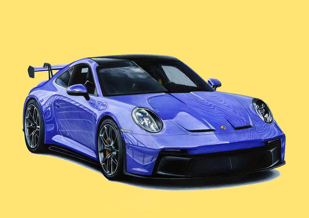
Another thing I look at is that the car fills the paper well.
For example, if you draw a side view of a car there is often way more white space above and below the car than to the left and right. This is also a reason why I avoid this specific angle.
When
a car is captured more at a front view angle it fills the paper better
as there is less white space below and above the car. Personally, I like
this more, but it does depend on what vision I have for the drawing.
Sometimes I rather have the drawing represent my vision than maximize the amount of paper that is filled by the car.
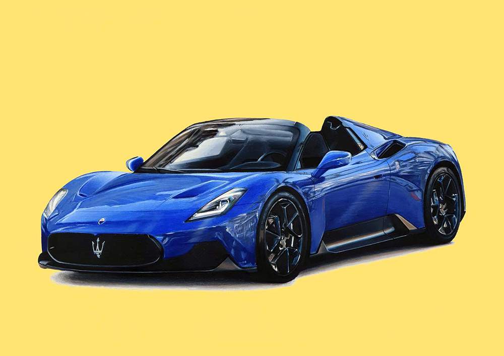
You can always change the size of the paper to match your drawing. However, I like to stick to standard sizes as they are easier to frame.
2. Color Reference
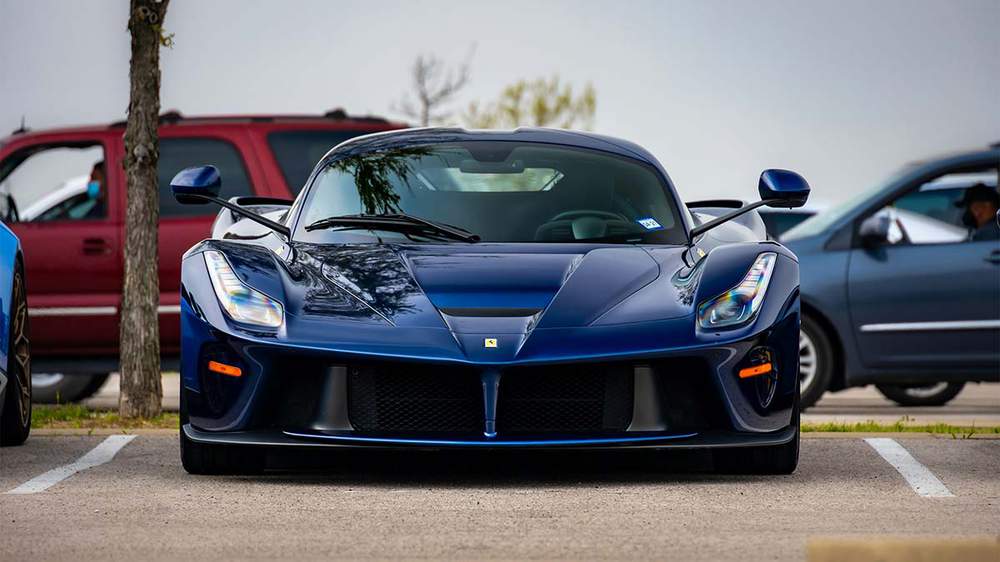
A color reference is always handy to have.
In a color reference, you can see how the paint color and type you want to draw behave. You can see how it reflects light, how light the lightest values and how dark the darkest values are, and how the color shifts when reflecting other colors.
I always try to find a photo of a car in the color I want to draw that has approximately the same lighting conditions as the reference photo for the lighting and reflections. This makes it easier to get the color more accurate to real life.
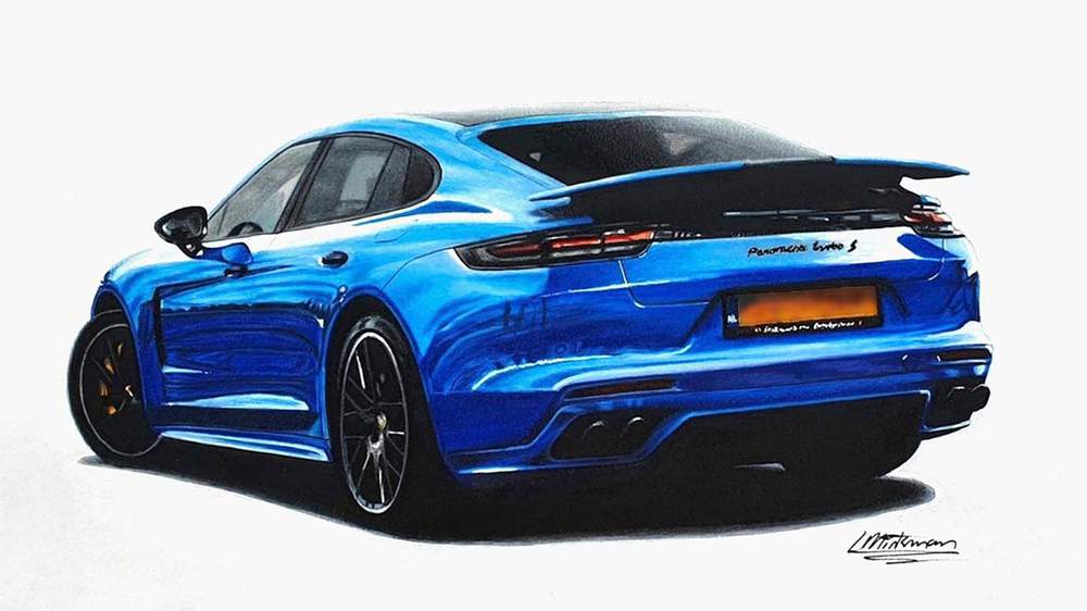
For the drawing below, I didn't use a reference photo for the color and that's pretty obvious. The color looks very unrealistic. It is more cyan in the lighter parts and more ultramarine in the darker parts. This is not at all how the color reflects light. The light parts should have been the same hue as the darker parts in this case.
Also, the way the light is reflected in my drawing is totally different from the paint color and type I wanted to create. The paint I wanted to recreate was more of a flat paint with less contrast between the lightest and darkest parts. However, it turned out way more metallic.
Maybe I'm just too critical, but it definitely would've turned out better if I had used a color reference.
When
choosing a color to draw, I always avoid matte paint colors, especially
black. In my opinion, matte cars are the most boring cars. The paint
doesn't create nice and sharp reflections. Instead, everything just
blends together and hides the beautiful shape of the car itself.
3. Reference for Lighting and Reflections
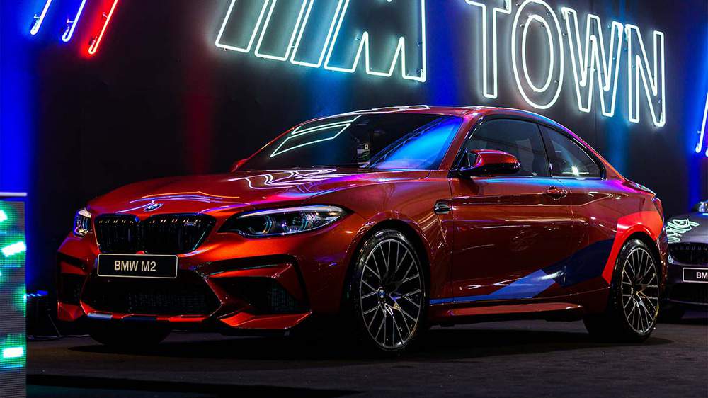
The reference photo for the lighting and the reflections is for me the most important one.
If the angle of the car you're drawing sucks, and the paint color isn't great, your drawing can still turn out to be a work of art if you're using a good reference for the lighting and reflections.
Avoid Basic Reflections
I avoid cars that only have basic reflections.
A car with basic reflections only has a horizon line as a reflection. Everything above the horizon line reflects the sky, and everything below reflects the ground.
Sometimes a car looks better with just the basic reflections, but often it looks better if it has more than just the basic reflections.
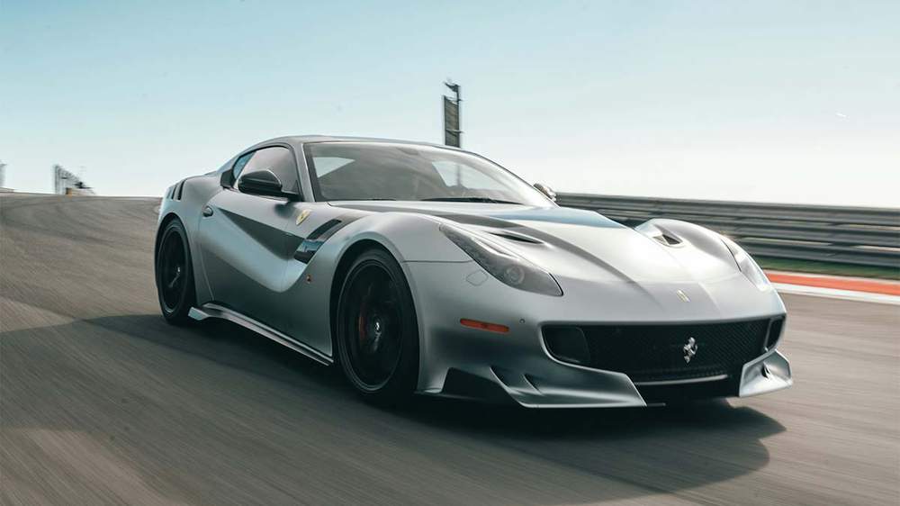
I always search for images where buildings, trees, lights, etc surround the car. This makes it look more interesting. However, it's important to choose a picture with not too many reflections. It needs to look interesting, not busy.
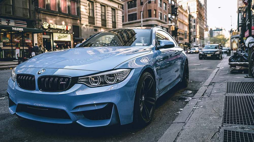
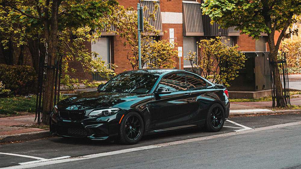
Color Nuances
I
also like it when there are some color nuances in the paint because of
the reflections and the lighting. A car without any color nuances can
look very monochrome which can in turn make it look less realistic. A
few nuances in the paintwork already make a big difference in my
opinion, but they are not crucial.
I have made plenty of car
drawings that look less realistic because they are too monochromatic as I
just recently found this out. And for each of these drawings I made, I
think they would've looked better with more color nuances in the
paintwork.
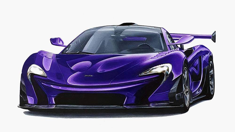
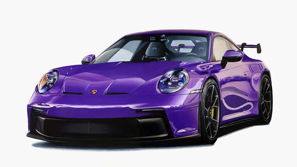
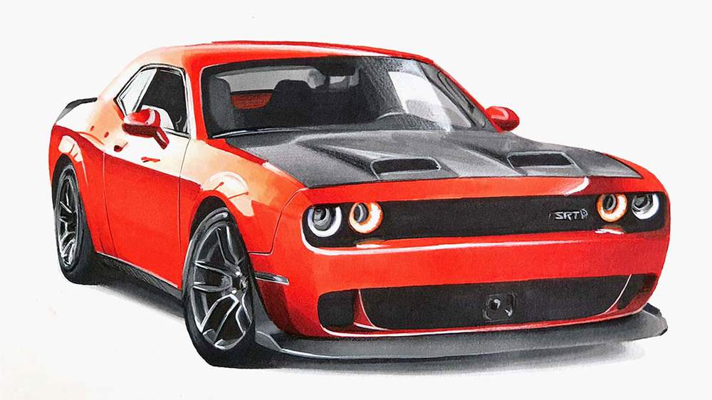
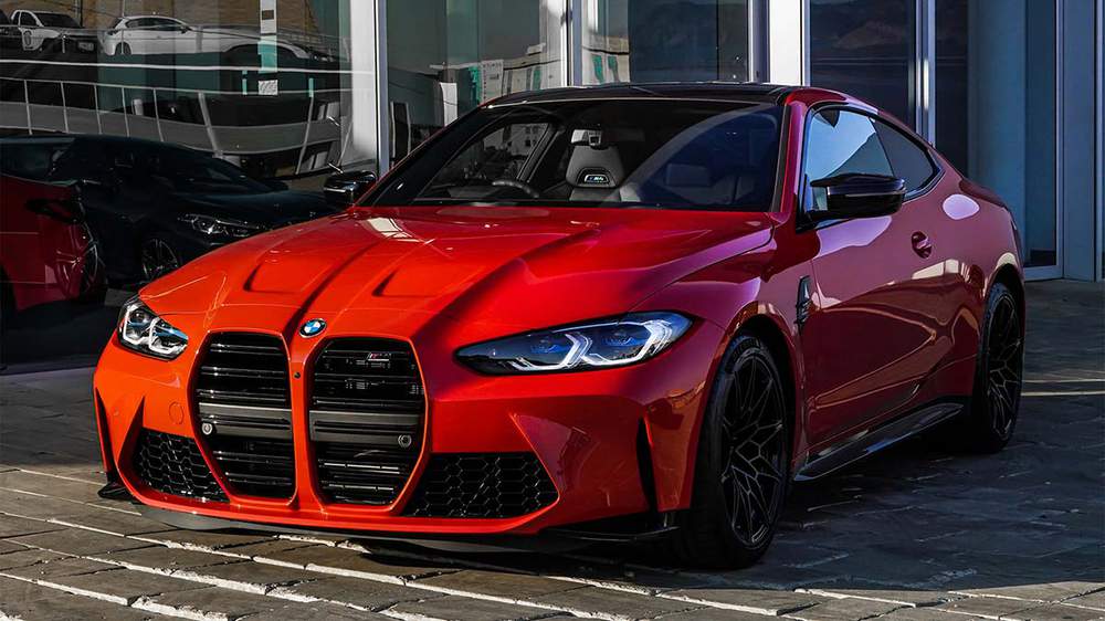
In the image below, the reflections on the car create some color nuances. The front of the car is more yellowish orange because of the light of the setting sun and the side is more blueish because of the blue sky and grayish because of the buildings.
How to Choose What Car to Draw
I
used to have trouble choosing what car to draw. Back then I used to
create my drawings from 1 photo and there were almost no photos that met
all my requirements so there was little choice. I would just draw the
cars I could find perfect reference photos for, no matter if I liked the
car or not.
But since I started using 3 reference photos I find it easier to choose what car to draw.
Draw Cars You Like
I just pick I car that I like. It's that simple.
You probably know a ton of cars on the top of your head that you like. Start by drawing those.
For
example, I really like Porsches, so I draw Porsches. I will never get
bored of drawing them and I don't mind drawing the same model over and
over again.
Visions
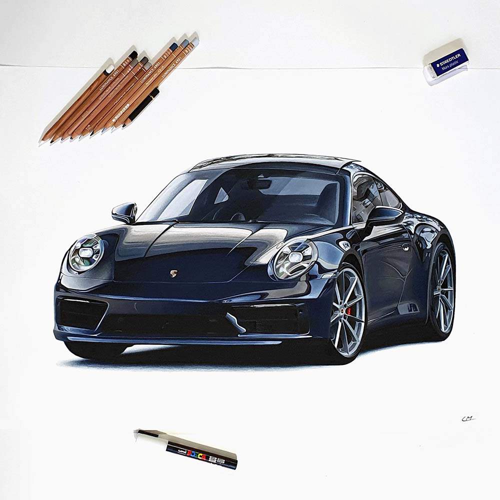
My Porsche 992 Carrera drawing
started with a vision. When driving on the highway, I saw this 992
Carrera driving by on the other side. Immediately a vision of a dark
blue one popped up in my head. It was a 3/4 front view from about eye
height with the front wheels turned.
Sources to Find Reference Photos
Now that you've chosen what car you want to draw, it's time to look for reference photos for that car.
There are plenty of sources to find good reference photos.
1. Instagram
Instagram
is a great place to find good reference photos. There are a ton of
professional automotive photographers on there that share their photos.
I follow a whole bunch of them and save their images if they inspire me.
2. Pinterest
Pinterest
is also a great source for professional reference photos for your car
drawings. Just search for the car you want to draw and pin or save
photos you like.
3. Friends and Family
If you're
lucky and have friends or family that regularly photograph cars you can
ask them if they have photos of the car you want to draw.
4. Royalty-Free Stock Website
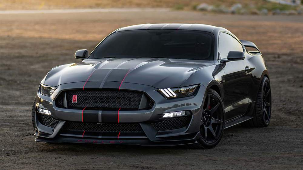
There are plenty of royalty-free stock websites like Pexels, and Unsplash. You can use the images you find on these websites free of charge and you don't need permission. You are even allowed to draw full copies of them if you want.
The one downside is that there is not much choice when it comes to good photos of cars. But you can definitely find enough good photos to inspire you. For example, most photos I used in this chapter come from Pexels or Unsplash.
5. Car Configurators
Car
configurators are a great source of reference photos, but the quality
is often not great. The generated images look more like screenshots from
a video game than a real-life car. That's why I only use them as loose
references.
6. Make Your Own
Of course, you can also make your own photos. If you can this is always the best option copyright-wise. When using your own photos you can't infringe on anyone else's photos, but the photos will only be as good as you can make them.
When creating your own photo, especially with mobile phones, you get a lot of perspective distortion, however. You can avoid this by zooming in by at least 2x, but this often makes the image blurry.
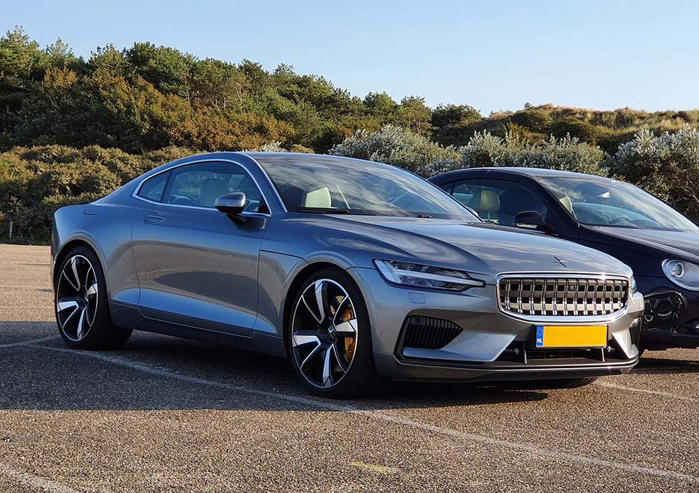
Car events, big cities like LA or Amsterdam, and Race Tracks are great places to spot and photograph cars. For example, just by going to the Nürburgring on a good day can give you enough reference photos to last a whole year!
You can also reach out to people with cars you want to draw and ask if they'd be down for a shoot.
My Process for Finding Reference Photos
Here's what I did to find the reference photos that I used for the Porsche 992 Carrera drawing:
I looked through my saved images
on Instagram and found one that represented my vision for the angle
well enough. I also found a GT3 on my hard drive with the perfect
reflections. And for the color, I used the Porsche car configurator.
Copyright when Using Reference Photos
The information provided in this section about copyright and the use of reference photos is based on my personal understanding and research. I am not a legal expert or professional, and this content should not be considered legal advice. For specific legal concerns or detailed guidance on copyright laws, please consult a qualified attorney or legal expert.
Unless stated otherwise, you always need to ask for permission to use the photos for your drawings, especially if you're going to copy them exactly.
Most photographers don't find it a
problem if you recreate one of their photos as long as you mention that
you used one of their photos as a reference.
If you're just using the photo as a reference for a single aspect of your drawing, like the reflections, and not your whole drawing, you might not need explicit approval.
I like to use multiple reference photos for my drawings so that I create a new and unique drawing that doesn't resemble a single photo. And because of this, I don't feel the need to ask for permission for every image I use as a reference for that drawing.

I love bringing cars to life with alcohol markers and colored pencils.
Whether you're just starting out or looking to improve your skills, I'm here to help!
Click here to learn more about me.


Add a comment
Comments
This is the best explanation i've seen!
It helps me a lot in drawing, thank you, I love your paintings