My Go-To Markers - Winsor & Newton Promarker (Brush) Review

Disclaimer: In the name of full transparency, please be aware that this blog post
contains affiliate links and any purchases made through such links will result in a
small commission for me (at no extra cost for you).
Review of: Winsor & Newton Promarker (Brush)

Price


A bit on the expensive side compared to similar brands

Nibs


Good for coloring large areas, but not ideal for details

Ink


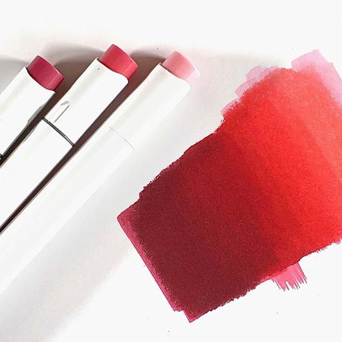
Very vibrant and easy to blend and color evenly

Color selection


Many light and mid tones, but not enough dark tones
What I like
- Even coverage when coloring large areas
- Easy blending
- Vibrant colors
- Available with bullet nib, brush nib, and chisel nib
What I don't like
- Difficult to draw tiny details
- Not enough dark colors
Summary: Winsor & Newton Promarkers are great markers for coloring larger areas and blending.
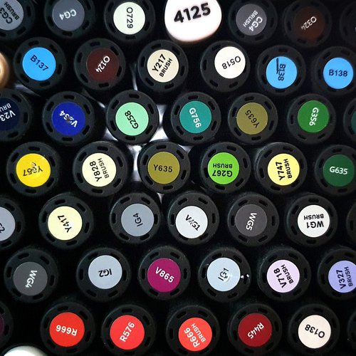
Promarkers are available in 2 configurations: a bullet nib and a chisel nib (Promarker) and a brush nib and a chisel nib (Promarker Brush). And you can choose from 204 colors. The color selection lacks some dark colors, but other than that there are many colors to choose from.
The Winsor & Newton Promarkers were the first alcohol-based markers I used. And to this day they are still my go-to markers.
My experience with the Winsor & Newton Promarkers
The design
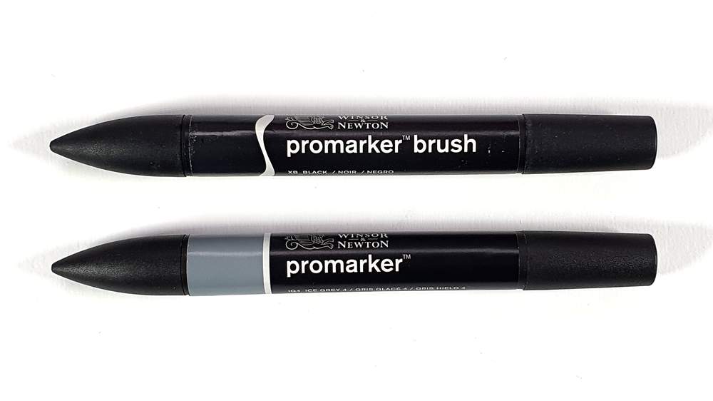
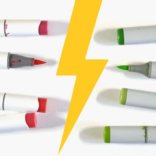
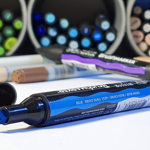
Promarkers have a round design, but they have a tiny stopper on one cap to prevent it from rolling off your table. The markers have an indication of the color towards the bullet nib or the brush nib and just before that a wavy line if it's a Promarker Brush or a straight line if it's a regular Promarker.
On the barrel, you can find the color name and code. The color code can also be found on the cap of the chisel nib.
Promarkers are not refillable and although you can take out the nibs Winsor & Newton doesn't sell replacement nibs.
The Nibs
Promarkers are available in 2 different configurations: the regular Promarker or the Promarker Brush (formerly known as the Brushmarker). The Promarker has a bullet nib and a chisel nib. The Promarker Brush has a brush nib and a chisel nib.
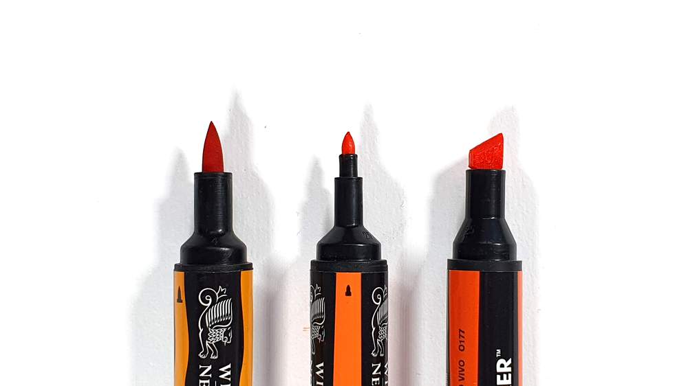
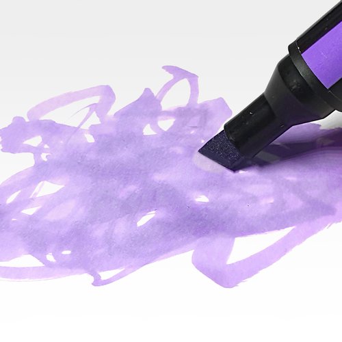
The chisel nib is nice and broad, especially compared to Copic markers. This makes it excellent for coloring in large areas which I do a lot. The chisel nib however is also very good for drawing narrow lines by only drawing with the side of the nib.
The brush nib is nice for blending colors, but it is a little softer than I would've liked. This does make it good for coloring larger areas, but it is far from ideal when you want to draw a consistent line or tiny details.
The bullet nib is great for coloring in tiny areas that need a little more precision, but due to the pace the ink flows out of the nib you need to be very quick and careful to prevent bleeding which can be a bit frustrating at times. Copics and Spectrum Noir markers have a more limited ink flow and are, because of that, more suitable for drawing tiny details. After a while, I've noticed that the tip of the bullet nib softens a little bit making it harder to draw tiny details and narrow lines.
Coloring with the Promarkers
As I already touched on before the Promarkers have a great ink flow. This makes them ideal for quickly drawing big areas, but less ideal for drawing tiny details. It can be frustrating at times and ruin your drawing (yes, I'm speaking from experience...) That is why I now often draw the details with colored pencils.
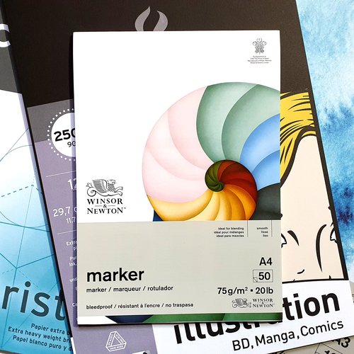
The ink of the Promarkers makes it really easy to color very evenly and blend well, especially on thicker paper like the Canson Illustration paper (my favorite paper for drawing with alcohol markers).
Color selection and numbering
I don't understand the color coding system Winsor & Newton uses for the Promarkers.
Every color code starts with a letter representing the color name like "R" for red and so on, but the 3 numbers that come after that letter seem to be chosen completely randomly.
I would've liked the colors to be sorted by hue, saturation, and value. This would make it a lot easier to pick colors of the same hue. But looking at the color chart they made they put no effort into making the order in which the colors look logical.
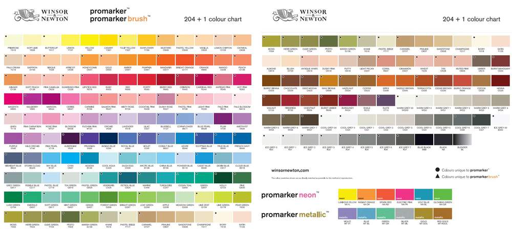
Since I first started using the Promarkers lots of light skin tones have been introduced. When I started making anime drawings there was only one really good skin tone, called Blush O729.
They've not only introduced some skin tones but also extra light and darker greys that they didn't have before (I just noticed it when looking at the color chart). This makes me excited because I've always complained about the CG5 being to light (which used to be the darkest grey) and the CG1 being too dark (which used to be the lightest grey).
I hope they'll also introduce some dark non-grey colors because the current color selection doesn't have many. When drawing I often find myself thinking: "I wish there was a darker color than this one."
Rating
Overall score:


Price:


Nibs:


Ink:


Color selection:






Be the first to comment!
Comments
There are no comments yet.