The 9 Fundamentals of Drawing Realism
In this article, we will explore the 9 Fundamentals of Drawing Realism, delving into essential concepts such as Observation, Proportions, 3D Form, Perspective, Value, Light and Shadow, Depth, Types of Edges, and Color Theories.
These fundamentals serve as the backbone of realistic drawing, guiding artists in their quest to translate the three-dimensional world onto a two-dimensional plane.
Curious about the top colored pencils for realistic drawings? My blog post has all the details on the 5 best options.
1. Observation

Observation is the cornerstone of realistic drawing. It's about more than just looking at an object; it's about truly seeing it, understanding its geometry, textures, and how light interacts with its surfaces.
Importance of Careful Study
Drawing from observation requires a keen eye and attention to detail. It's about recognizing and understanding the shapes, lines, angles, and textures that make up an object. By training your eyes to see these details, you can capture them accurately in your drawing. Here's how:
Study the Subject: Spend time observing your subject before you even pick up your pencil. Notice the details and how they relate to one another.
Sketch from Life: Whenever possible, draw from real objects rather than photographs. This practice can help develop a deeper connection and understanding of the subject.
Recognizing Shapes, Lines, Angles, and Textures
Breaking down complex objects into basic geometric shapes and lines can make drawing more manageable. Here are techniques to help you with this process:
Identify Basic Shapes: Look for circles, squares, triangles, etc., within your subject. This approach helps in creating an accurate outline.
Analyze Angles: Notice the angles at which lines meet, as getting these right can make a drawing more accurate.
Understand Textures: Observe the surface textures, such as roughness or smoothness, and consider how to represent them through line work or shading.
Techniques for Honing Observational Skills
Practicing and refining your observational skills is vital for improving realism in your drawings. Here's how you can do it:
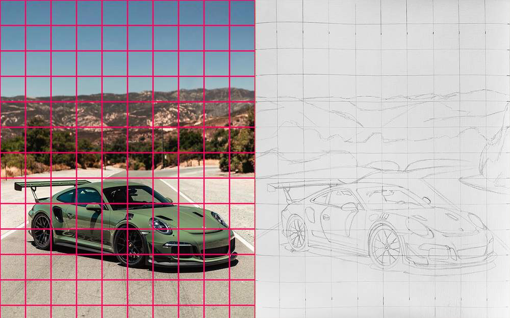
Grid Method: By overlaying a grid on your reference image and your drawing paper, you can more easily align the components of your drawing.
Contour Drawing: This exercise focuses on drawing the outlines of an object without looking at your paper, training your hand to follow your eye.
Thumbnail Sketching: Quick, small sketches can help you understand the subject's overall shape and proportion without getting lost in details.
Developing a Visual Library
A visual library is a mental collection of images, shapes, and textures that you've observed and can recall when needed. Building this library can aid in drawing from memory and imagination.
Constant Practice: Regularly sketching different subjects helps build this visual library.
Memory Drawing: Try drawing something you've seen earlier without reference, and then compare it with the original to spot discrepancies.
Using Reference Images
While drawing from life is often preferable, reference images can be handy tools.
Choosing Good References: Look for clear, high-quality images that accurately represent the subject.
Analyzing References: Spend time studying the reference, observing the same aspects you would if the object were in front of you.
Observation is a multifaceted skill that requires patience and practice. By truly seeing and understanding the subject, rather than just looking at it, you can create more lifelike and accurate drawings. Whether a beginner or a seasoned artist, continually honing your observational skills will enhance your ability to draw with realism.
2. Proportions
Proportions play a vital role in the realistic representation of subjects in drawing. This aspect refers to the relative sizes and relationships between different parts of an object or figure. Getting proportions correct is essential for capturing the likeness and integrity of the subject.
Understanding the Relative Sizes
Proportions are all about understanding the relative sizes of different parts of the object or figure.
Importance: Even a minor disproportion can significantly affect the appearance and realism of the drawing.
Analyzing Relationships: Determine how different parts relate to each other in size, such as the length of an arm compared to the body, or the size of an eye relative to the face.
Techniques for Getting Proportions Right
Several techniques can aid in achieving correct proportions:
Alignment: Check how different parts align with each other horizontally and vertically. For example, the corners of the eyes might align with the edges of the mouth.
Measuring: Using your pencil or another tool to measure and compare different parts of the object can be helpful.
Sighting: This method involves holding a pencil or another straight edge at arm's length and using it to compare angles and distances.
Using Grids: Similar to the grid method in observation, a grid can be used to break down the drawing into smaller, more manageable sections.
Common Mistakes and Tips for Correcting Them
Understanding and avoiding common mistakes can aid in achieving accurate proportions:
Overemphasis on Certain Features: Avoid giving undue importance to prominent features, like eyes in a portrait, as this can lead to disproportion.
Consistent Re-evaluation: Continually step back and assess the drawing from a distance to catch disproportion early in the process.
Upside-Down Drawing: Viewing the drawing or reference image upside down can provide a fresh perspective, making disproportion easier to spot.
Practice Through Different Subjects and Scales
Proportions may vary widely depending on the subject and the scale of the drawing.
Various Subjects: Practice drawing different objects and figures to develop a keen eye for proportion.
Different Scales: Drawing the same subject at various sizes helps in understanding how proportions scale, further sharpening your skills.
Mastering proportions is a crucial skill for realistic drawing. By employing the techniques described above and maintaining a critical and attentive eye, artists can achieve a lifelike representation that resonates with the viewer. Like all artistic skills, achieving correct proportions requires patience, practice, and a willingness to learn from mistakes and grow.
3. 3D Form
Realistic drawing goes beyond mere lines and shapes; it's about translating the three-dimensional world onto a two-dimensional plane. Understanding and depicting 3D form is central to creating drawings that feel tangible and lifelike.
Rendering 3D Shapes and Forms
The foundation of 3D drawing starts with understanding simple geometric shapes and how to render them:
Basic Geometric Forms: Understanding how to draw spheres, cubes, cylinders, cones, etc., is vital as complex objects can often be broken down into these simpler forms.
Combining Shapes: Many objects can be seen as combinations of these basic shapes. Learning to assemble them helps in drawing more complex forms.
Understanding Shading and Volume
Shading is a powerful tool to convey volume and solidity:
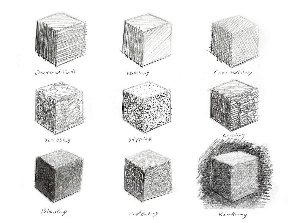
Shading Techniques: Different shading techniques like hatching, cross-hatching, and blending can be used to show form.
Light Direction: Consider the direction of the light source and how it interacts with the object. This will affect both the placement and quality of shadows and highlights.
Shadow Mapping: Understanding core shadows, cast shadows, and reflected light can add realism to the depiction of form.
Using Cross-Contour Lines
Cross-contour lines follow the contours of the object and can indicate the direction of the form:
Understanding Cross-Contours: These are lines that flow over the surface of the form, helping to describe its three-dimensionality.
Applying Cross-Contours: Use them sparingly and in conjunction with shading to create a more rounded appearance.
Techniques for Conveying Texture
The texture of a surface plays a critical role in its appearance:
Analyzing Texture: Look closely at the object to understand its texture. Is it smooth or rough, hard or soft?
Texture Techniques: Utilize different strokes, patterns, and shading techniques to represent various textures accurately.
Understanding Perspective in 3D Form
3D form is inherently linked to perspective:
Aligning Shapes in Perspective: Ensure that all geometric forms align according to the chosen perspective. For example, in two-point perspective, the sides of a cube will converge to two vanishing points.
Foreshortening: This refers to the visual effect where an object appears shorter than it actually is due to perspective. Understanding and depicting foreshortening is crucial in representing 3D forms accurately.
Practice Through Various Exercises
Constant practice with different objects and from different viewpoints is essential:
Draw from Life: Try drawing simple objects around you, considering their 3D form.
Experiment with Lighting: Play with different lighting conditions to understand how light and shadow define form.
3D form is an essential aspect of realistic drawing, creating depth and tangibility in your artwork. Understanding the basic geometric forms, mastering shading, using cross-contour lines, and being aware of texture and perspective will help you translate the three-dimensional world onto paper. Like any art skill, continuous practice, observation, and experimentation are key to mastering 3D form.
4. Perspective
Perspective is a critical element in drawing that helps to create a three-dimensional illusion on a two-dimensional surface. It's the way we represent objects in space relative to the observer's viewpoint. Mastering perspective allows an artist to depict a three-dimensional scene accurately and convincingly.
Types of Perspective
There are several different approaches to perspective, each serving a particular purpose:
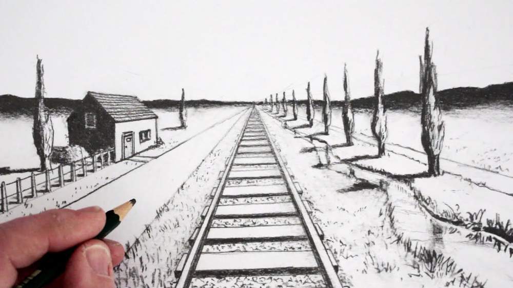
One-Point Perspective: This is used when viewing objects directly from the front. All horizontal lines converge at a single vanishing point on the horizon line.
Two-Point Perspective: Useful when viewing objects from an angle, where lines converge to two different vanishing points on the horizon line.
Three-Point Perspective: Employed when looking up or down at an object, adding a third vanishing point either above or below the horizon line.
Atmospheric Perspective: This conveys depth by changing color and clarity of objects intended to be perceived as distant.
Understanding Horizon Line and Vanishing Points
The horizon line and vanishing points are fundamental in perspective drawing:
Horizon Line: This is the eye level of the viewer, where the sky meets the ground. All parallel horizontal lines converge to the horizon line.
Vanishing Points: These are points on the horizon line where parallel lines appear to converge. They're crucial for determining the direction and angle of lines.
Techniques to Depict Foreshortening
Foreshortening is an effect of perspective that makes an object or figure in a picture in depth appear shorter than it is:
Understanding Foreshortening: Learn how objects appear shorter as they recede in space.
Practice with Simple Shapes: Start with simple geometric forms to understand how they appear foreshortened from various angles.
Use Overlapping Elements: Overlapping parts of an object can emphasize foreshortening and create depth.
Tools and Techniques to Accurately Represent Perspective
Using the correct tools and techniques can make perspective drawing more accessible:
Use a Ruler or Straight Edge: This helps in drawing precise lines that converge accurately at the vanishing points.
Create a Perspective Grid: A grid with lines converging at the vanishing points can be a valuable guide for complex scenes.
Perspective Drawing Software: Various digital tools can assist in creating accurate perspective layouts, particularly useful for complex scenes.
Considerations for Composition
Perspective not only adds realism but also contributes to the composition:
Leading Lines: Use converging lines to lead the viewer's eye into the drawing.
Placement of Horizon Line: The position of the horizon line can dramatically affect the viewer's experience of the scene, whether they feel above, within, or below it.
Common Mistakes and How to Avoid Them
Understanding common mistakes can help avoid them:
Misplaced Vanishing Points: Ensure that vanishing points are accurately positioned on the horizon line.
Inconsistent Perspective: Make sure that all elements in the drawing adhere to the same perspective rules.
Perspective is an essential tool for creating depth and spatial relationships in a drawing. Whether depicting a simple object or a complex landscape, understanding and applying the principles of perspective will add realism and depth to your artwork. Through continuous practice, critical observation, and using the right tools, you can master perspective and create compelling and realistic drawings.
5. Value

Value in art refers to the relative lightness or darkness of a color. It's one of the fundamental elements that can bring a drawing to life, providing a sense of volume, form, and depth. In realistic drawing, mastering the use of value is essential for creating a convincing three-dimensional illusion.
Understanding Value in Drawing
Value plays a crucial role in the following aspects:
Defining Form: By using varying values, you can create the illusion of volume in three-dimensional shapes.
Creating Depth: Value can help convey spatial depth, with lighter values often appearing to recede and darker values appearing to come forward.
Enhancing Mood and Atmosphere: Different value arrangements can create various moods and atmospheres, such as high contrast for dramatic effect or subtle transitions for a calm mood.
Value Scales
A value scale is a tool to understand and practice value:
Creating a Value Scale: This typically consists of a series of steps from white to black, with several shades of grey in between. It serves as a reference for recognizing and mixing different values.
Practicing with Value Scales: Regular practice in creating smooth transitions between values on a scale will enhance control over shading.
Techniques for Creating Value
There are several ways to create value in a drawing:
Hatching and Cross-Hatching: This involves drawing closely spaced parallel lines, with cross-hatching adding another layer of lines at an angle.
Stippling: This technique uses small dots to build up value, with more dots creating darker areas.
Blending: Soft transitions can be achieved by smudging or blending lines or shading.
Erasing Techniques: Erasers can be used as drawing tools to create lighter values or highlights.
Considerations for Material and Light Source
Understanding the material of the subject and the light source is key:
Material Considerations: Different materials reflect light differently, and understanding these properties can make your drawing more realistic.
Light Source Direction: The direction and quality of light will significantly affect the values in your drawing. Consistency in portraying this will add to the realism.
Applying Value to Different Elements
Value can be applied to different elements in a drawing:
Shadows: Understanding cast shadows and form shadows and how to depict them with appropriate values.
Highlights: Placing highlights accurately and with the correct value can add sparkle and life to a drawing.
Textures: Value is essential in rendering different textures, with specific value patterns representing various surface qualities.
Common Mistakes and How to Avoid Them
Being aware of common mistakes can guide your practice:
Over-Blending: This can lead to a loss of richness and variety in value. Knowing when to blend and when to leave texture is key.
Ignoring Mid-Tones: Mid-tones are essential for a full range of value and form. Don't focus solely on dark and light areas.
Value is a versatile and vital element in realistic drawing. Whether rendering the soft curves of a face or the stark angles of architecture, understanding and skillfully using value can breathe life and depth into your work. Regular practice, keen observation, and mindful application of techniques will empower you to harness the full potential of value in your artistic endeavors.
6. Light and Shadow
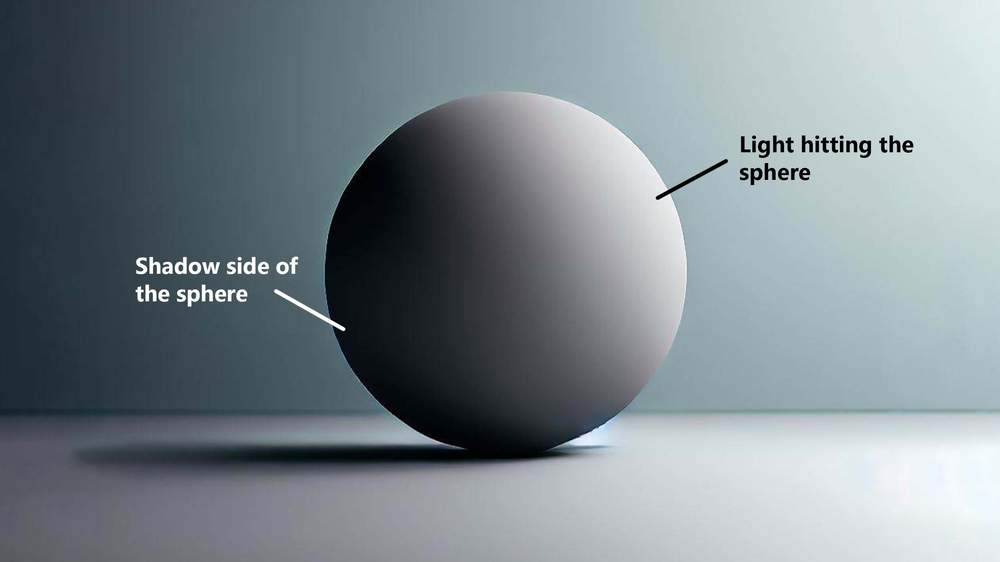
Light and shadow are indispensable elements in creating realistic drawings. They provide form, depth, contrast, and emotion to an image. Understanding how light interacts with objects, and how it influences the shadows and highlights, can take your drawing skills to the next level.
Principles of Light and Shadow
Understanding these principles is foundational:
Direction of Light: Knowing where the light is coming from will determine where shadows and highlights are placed.
Quality of Light: The quality (hard or soft) of light affects the edges of shadows and the transition between light and dark areas.
Contrast: The relationship between light and dark areas provides contrast, a crucial factor in defining forms and creating visual interest.
Types of Light Sources
Different light sources produce varied effects:
Direct Light: Comes from a single, clear source like the sun or a spotlight, creating strong highlights and shadows.
Diffuse Light: Found on cloudy days or in shaded areas, producing softer transitions and less pronounced shadows.
Reflected Light: Light bouncing off surfaces can influence the shadow areas, often softening them or changing their color.
Understanding Shadow Anatomy
Shadows in drawing can be broken down into different parts:
Cast Shadow: The dark area that occurs when an object blocks the light source.
Core Shadow: The darkest part of a shadow on the object itself, where the light is completely blocked.
Reflected Shadow: The part of the shadow where light is bouncing back and illuminating some of the shadow area.
Occlusion Shadow: Dark areas where surfaces come close together, and little light reaches.
Techniques for Rendering Light and Shadow
Specific techniques can help render light and shadow realistically:
Observation: Carefully study how light interacts with the subject in real life or in reference photos.
Value Control: Using a full range of values from light to dark to depict shadows accurately.
Edge Control: Understanding where to place hard and soft edges can make the shadows more believable.
Temperature Shifts: Using warm and cool colors (in color drawings) can enhance the realism of light and shadow.
Impact on Composition and Emotion
Light and shadow can greatly influence the mood and composition:
Guiding the Eye: Using light and shadow strategically can guide the viewer's eye through the composition.
Creating Mood: Shadows can add drama, mystery, or tranquility, depending on how they are used.
Common Mistakes and How to Avoid Them
Awareness of common pitfalls is beneficial:
Inconsistent Light Source: Ensure that all shadows and highlights are consistent with the direction and quality of the light source.
Ignoring Reflected Light: Observing and including reflected light can add a level of sophistication to your shadows.
Over-Darkening Shadows: Keeping some level of detail in shadows instead of going completely black can retain form and depth.
Mastering the depiction of light and shadow is crucial for realistic drawing. It not only helps define form and space but also adds emotion and life to your artwork. Observing real-life scenarios, practicing with various light conditions, and applying learned techniques will enhance your ability to represent light and shadow accurately, enriching your artistic repertoire.
7. Depth

Creating a sense of depth in a drawing is vital for achieving realism. It transforms a flat, two-dimensional surface into a window that seems to extend into a three-dimensional space. The understanding and proper application of depth can make a scene come alive, capturing the viewer's attention and drawing them into the artwork.
Overlapping
Overlapping objects is one of the simplest ways to create depth:
Understanding Overlapping: Objects that are closer will cover part of the objects that are further away.
Practical Application: Practice drawing scenes where objects overlap each other, keeping in mind their relative positions and sizes.
Size and Placement
The size and placement of objects play a crucial role in portraying depth:
Size Differences: Objects that are closer appear larger, while those farther away appear smaller.
Placement on the Page: Objects placed higher on the page often appear more distant, while those lower appear closer.
Atmospheric Perspective
This technique adds depth by simulating how the atmosphere affects how distant objects appear:
Color Changes: Distant objects tend to appear lighter and bluer.
Decreased Contrast: Far-off objects have softer edges and less contrast.
Application in Landscapes: This can be particularly effective in landscape drawings where there are vast distances to convey.
Linear Perspective
The use of linear perspective, as explored earlier, is a mathematical system artists use to create the illusion of depth and volume on a flat surface:
One, Two, and Three-Point Perspective: These techniques can be employed based on the viewpoint and complexity of the scene.
Horizon Line: Remembering the placement and role of the horizon line in conveying depth.
Texture Gradient
Texture can also be used to indicate depth:
Closer Objects: These often have more detailed and defined textures.
Distant Objects: These often appear smoother and less detailed.
Shadows and Highlights
Proper use of light and shadow, as previously discussed, is vital in depicting depth:
Understanding Shadows: The accurate placement of shadows can give volume to objects and set them in space.
Highlights: These can emphasize the form and position of objects, adding to the sense of depth.
Composition and Focal Points
How the elements are composed within the drawing can affect the perception of depth:
Leading Lines: Lines that lead the eye into the distance can create a strong sense of depth.
Focal Points: Having clear focal points and arranging them thoughtfully can enhance the sense of distance.
Common Mistakes and How to Avoid Them
Avoiding common mistakes is key to achieving convincing depth:
Inconsistent Scaling: Ensuring that objects are scaled properly according to their distance.
Ignoring Atmospheric Effects: In landscapes, ignoring atmospheric perspective can result in a flat appearance.
The perception of depth is an essential aspect of realistic drawing. It involves various interconnected techniques and principles that work together to create a convincing three-dimensional space on a two-dimensional plane. Continuous practice, keen observation, and mindful application of these techniques will allow you to create drawings with a profound sense of depth, adding life and dimension to your work.
8. Types of Edges
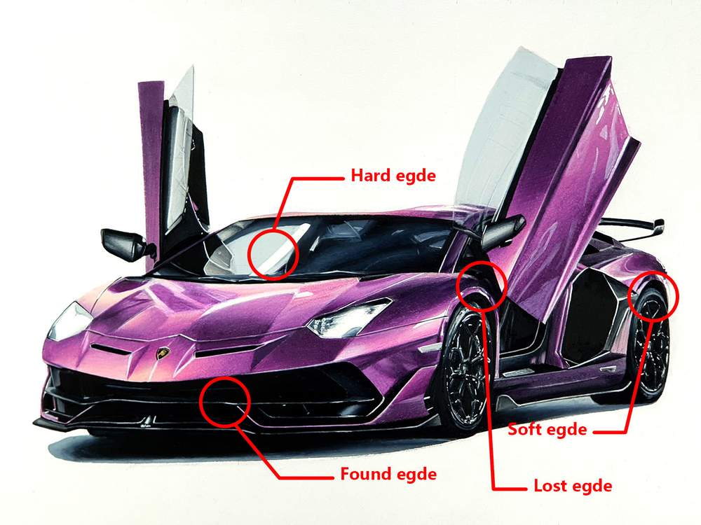
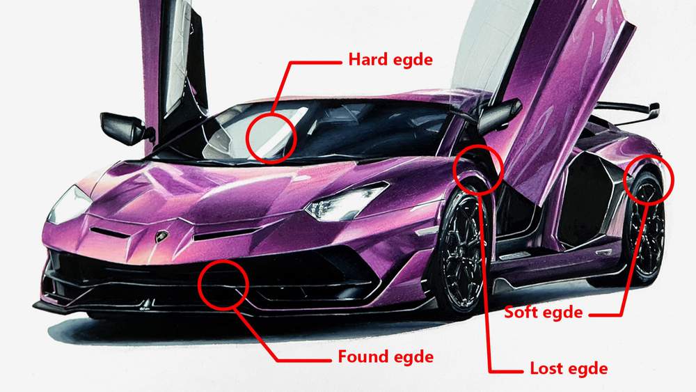
In the realm of drawing realism, understanding and applying different types of edges is crucial. Edges are where two shapes meet, and the way these edges are handled can convey a variety of characteristics and qualities. They can show the form, texture, distance, lighting, and emotional tone within a drawing.
Hard Edges
Hard edges are clear and sharply defined:
Characteristics: They have a high contrast and are often used to define a clear boundary between two forms.
Usage: Great for depicting surfaces in direct light, defining the contour of an object, or emphasizing a strong shadow.
Examples: The edge of a building in sunlight, the crisp outline of eyeglasses, etc.
Soft Edges
Soft edges are gradual transitions between shapes:
Characteristics: They provide a smooth transition from one value or color to another.
Usage: Ideal for showing surfaces in diffused light, portraying soft textures, or indicating objects in the distance.
Examples: The shadow side of a rounded object, the transition between sky and distant mountains, etc.
Lost Edges
Lost edges occur when an edge is not visible:
Characteristics: The transition between shapes is so subtle that the edge is "lost."
Usage: Useful for showing objects that are very close in value or color, or for creating a specific atmospheric effect.
Examples: A dark object against a dark background, the soft contour of a cheek in shadow, etc.
Found Edges
Found edges are the opposite of lost edges:
Characteristics: An edge that is "found" or emphasized.
Usage: Effective for drawing attention to a specific area or for depicting an object in bright light.
Examples: The shiny highlight on a wet surface, the sharp contour of a brightly lit figure, etc.
Combining Different Types of Edges
In realistic drawing, a combination of different types of edges is often used:
Understanding Context: Recognize the context of what you are drawing and what types of edges would be appropriate.
Practical Application: Practice using different types of edges within the same drawing to convey different textures, distances, and lighting effects.
Techniques for Creating Edges
Different techniques can be used to create various types of edges:
For Hard Edges: Use a well-sharpened pencil, clear strokes, and high contrast in values.
For Soft Edges: Employ blending techniques, such as using a blending stump or your finger.
For Lost and Found Edges: Carefully control value and color transitions, paying close attention to reference material or observation.
Common Mistakes and How to Avoid Them
Understanding common mistakes can help you master edges:
Overuse of Hard Edges: This can make a drawing appear unnatural or overly rigid.
Ignoring the Context: Consider the material, lighting, distance, and other factors that influence the type of edge needed.
Understanding and skillfully applying different types of edges is vital for drawing realism. They help convey the physical and emotional characteristics of the subject and add nuance and complexity to your artwork. Experimenting with different types of edges and being mindful of their context and purpose will elevate your drawing practice, allowing you to capture the intricate beauty and variety of the world around you.
9. Color Theorie
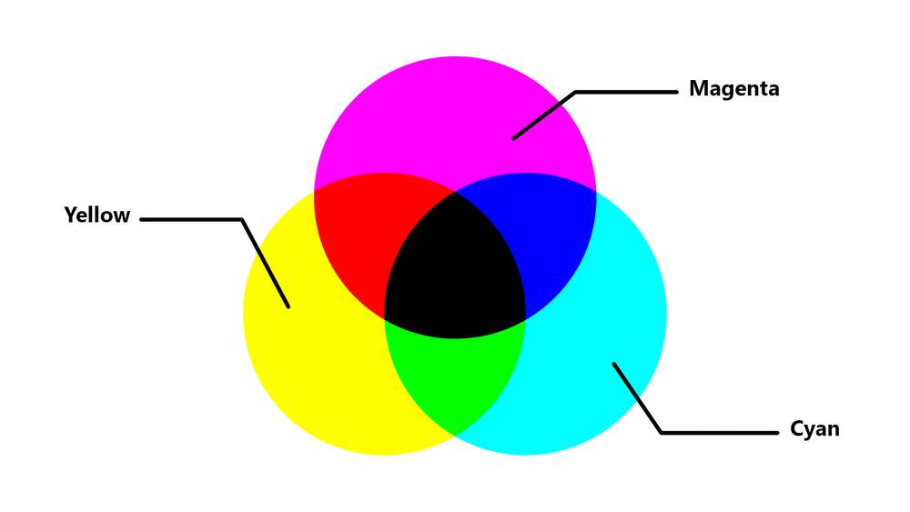
Color is a powerful tool in the artist's toolkit and plays a significant role in creating realistic drawings. The proper use of color can add life, depth, mood, and energy to a piece of art. It can also enhance the portrayal of light, material, and form.
The Color Wheel
Understanding the color wheel is foundational:
Primary Colors: Magenta, cyan, and yellow - the building blocks of all other colors.
Secondary Colors: Green, red, and blue - created by mixing primary colors.
Tertiary Colors: Created by mixing a primary and a secondary color.
Complementary Colors: Colors opposite each other on the wheel, like red and green.
Color Harmony
Creating harmony in your color choices can lead to more pleasing compositions:
Analogous Colors: Colors next to each other on the wheel, creating a harmonious effect.
Triadic Harmony: Using three evenly spaced colors around the wheel for a vibrant look.
Monochromatic Scheme: Using variations in lightness and saturation of a single color.
Temperature
Color temperature can add depth and emotion:
Warm Colors: Reds, oranges, and yellows are seen as warm and can convey energy or warmth.
Cool Colors: Blues, greens, and purples are seen as cool and can convey calmness or distance.
Value
Value refers to the lightness or darkness of a color:
Importance of Value: Understanding value is crucial for defining form and creating the illusion of three dimensions.
Value Scale: Creating a scale from light to dark can help you understand and use value effectively.
Saturation
Saturation describes the intensity of a color:
High Saturation: Vibrant, pure colors.
Low Saturation: Dull, muted colors.
Using Saturation: Controlling saturation can affect the mood and focus of a drawing.
Color and Light
How color behaves under different lighting conditions:
Effect of Light Source: Different lights (e.g., sunlight, incandescent) can change how a color appears.
Shadows and Highlights: Colors change in value and hue in shadows and highlights.
Techniques for Mixing and Applying Color
Effective ways to mix and apply color:
Layering: Building up color through layers can create depth and richness.
Blending: Using blending tools or techniques to create smooth transitions.
Glazing: Applying thin layers of transparent color can create luminous effects.
Psychological and Emotional Impact
Colors can have psychological effects:
Color Symbolism: Different cultures or contexts might associate specific meanings or emotions with certain colors.
Personal Responses: Individual reactions to color can vary widely.
Common Mistakes and How to Avoid Them
Awareness of common pitfalls:
Muddy Colors: Over-mixing can lead to dull, muddy colors. Understanding color relationships can help avoid this.
Inconsistent Lighting: Ensure that colors correspond with the direction and type of light source in your drawing.
Mastering color theories and their application is essential for achieving realistic drawing. Color is not just a visual element; it's a complex and expressive component that can convey depth, form, emotion, and atmosphere. Through mindful study and practice of these principles, you can unlock the potential of color in your artwork, creating compelling and lifelike representations of the world around you.







Be the first to comment!
Comments
There are no comments yet.