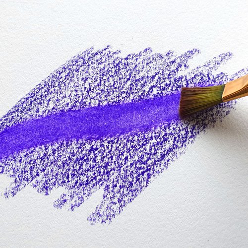
9 Common Mistakes To Avoid When Using Colored Pencils
Colored pencils, with their vast array of hues and versatile application, are a favorite medium for both novice and seasoned artists.
But like any art form, mastering colored pencils requires understanding common pitfalls.
For beginners embarking on this vibrant journey, being aware of these mistakes can be the difference between a piece that shines and one that falls flat.
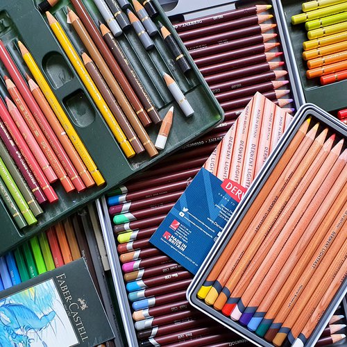
If you're just starting out and don't know which colored pencils to buy, check out this list I made of the best colored pencils for beginners.
Mistake #1: Using the Wrong Paper
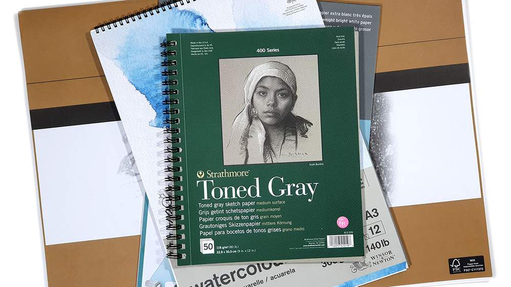
When beginning with colored pencils, it's easy to overlook the importance of the paper you're using. However, the paper serves as the foundation of your artwork, and choosing the right kind can make a significant difference.
The texture of the Paper
The texture of the paper, often referred to as its "tooth," determines how well the paper can grip the colored pencil pigment. A paper with a good tooth will hold more layers and allow for richer color application. For beginners, a light-textured paper is often recommended because it strikes a balance - allowing for multiple layers without being overly rough.
The Weight of the Paper
Weight refers to the thickness and sturdiness of the paper. A heavier-weight paper is less likely to tear or get damaged, especially when applying pressure. For colored pencil work, a paper weight of at least 70lbs (120gsm) is advisable, but I prefer a weight of at least 120lbs (200gsm).
For a more in-depth look on how to choose paper for colored pencils, check out this article I wrote.
Using the right paper is foundational for achieving the best results with colored pencils. It's not just a backdrop but an active participant in how the colors lay down, blend, and layer. By being aware of the aspects mentioned above and investing time in choosing your paper wisely, you're setting yourself up for success from the very start.
Mistake #2: Not Layering Enough
Layering is one of the essential techniques when working with colored pencils. It allows for depth, luminosity, and richness in your artwork. However, many beginners overlook the importance of layering or are not aware of its potential.
Why is Layering Important?
Depth and Dimension: Layering multiple shades of color provides depth to an image. A single shade can appear flat, but with successive layers, you can achieve a three-dimensional look.
Vibrancy: Layering can enhance the vibrancy of colors. When colors are layered and blended, they can pop more than when applied singly.
Blending: The magic often happens when two or more colors are layered over each other. This can create beautiful transitions and gradients, essential for realistic artwork.
Texture Creation: The way you layer and the patterns in which you apply your colors can mimic real-life textures, like the fur of an animal or the sheen on an apple.
Tips for Effective Layering
Start Light: Begin with a light hand. It's easier to add more layers than to correct a heavy, saturated layer.
Use a Sharp Pencil: A sharp pencil allows for finer, more controlled layers. This can be especially helpful when you're working on detailed areas.
Cross-hatching: This technique involves making tiny X's with your pencil. It's an effective way to layer colors without overly saturating the paper.
Be Patient: Good layering takes time. Don't rush the process. As you add more layers, you'll notice the colors becoming more vibrant and the details sharper.
Practice: Like all techniques, practice makes perfect. Experiment with layering different colors to see the effects.
Layering is a powerful technique in colored pencil art. When done correctly, it can elevate a drawing from simple to spectacular. It's all about building colors gradually, understanding how different shades interact, and having the patience to meticulously develop your piece. If you're new to colored pencils, embrace the layering process, and you'll soon see the depth and vibrancy it can add to your artworks.
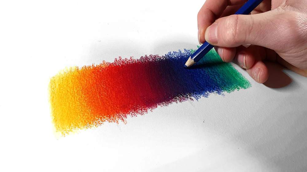
Mistake #3: Not Applying Enough Pressure
Pressure control is a fundamental aspect of working with colored pencils. Knowing when and how much pressure to apply can greatly influence the final appearance of your artwork. Many beginners (including me...) tend to be too gentle with their strokes, leading to pale and unsaturated results.
Why is Pressure Control Important?
Saturation: Applying the right amount of pressure is essential for achieving the desired color saturation. Light pressure will result in a faint color application, while heavier pressure will produce a more vibrant and bold color payoff.
Blending: Pressure plays a pivotal role in blending. A gentle hand is often used for initial layers, with increased pressure for subsequent layers to seamlessly blend colors together.
Texture Creation: Different pressures can be used to mimic textures. For instance, light pressure can be ideal for creating the softness of a petal, while heavy pressure might be used for the roughness of tree bark.
Avoiding Grooves: If not enough pressure is applied, the pencil might only color the peaks of the paper's texture, leaving white valleys (grooves) untouched. This can result in a grainy appearance, which I personally really dislike and it was a big reason why I hated colored pencils when I first started out.
Tips for Proper Pressure Application
Practice on Scrap Paper: Before diving into your artwork, use a scrap piece of the same paper to test out different pressure levels and see the results.
Hold Pencil Correctly: Holding the pencil further back allows for lighter, broader strokes. Holding it closer to the tip can give you more control for heavier, finer lines.
Layering and Pressure: Remember, it's often best to start with light layers and gradually increase pressure as you build up the colors. This technique provides more control over the final appearance.
Use the Right Pencil: Some colored pencils are softer than others. Soft pencils deposit more pigment even with light pressure, while hard pencils might require a bit more force. Familiarize yourself with the pencils you're using.
The amount of pressure you apply while coloring can make or break your artwork. Not applying enough pressure can leave your artwork looking unfinished and lacking depth. But with practice, understanding your pencils, and developing a feel for the right amount of pressure, you can bring out the full potential of your colored pencils and create stunning, vibrant pieces.
Mistake #4: Using Too Much Pressure Too Soon
While we've discussed the implications of not applying enough pressure, going to the other extreme - using too much pressure early in the process - can also hinder your colored pencil artwork.
Why Is Avoiding Excessive Early Pressure Important?
Limited Layering: One of the biggest disadvantages of applying too much pressure too soon is that it fills the tooth of the paper quickly. Once the tooth is saturated, it becomes challenging to add additional layers, thereby limiting the depth and richness you can achieve.
Difficulty in Correcting Mistakes: Heavy-handed initial layers make errors harder to correct. Whether you're trying to erase or layer a different color over the top, a saturated base will be less forgiving.
Uneven Application: Pressing hard can lead to uneven color application, especially if the pressure is not consistent. This can result in a patchy appearance.
Tips to Prevent Using Excessive Pressure Early On
Mindful Coloring: Stay aware of your hand's pressure. Consistently remind yourself, especially when starting a new artwork, to begin with a lighter hand.
Build Layers Gradually: Start with light layers, gradually increasing pressure as you progress. This technique offers more control over color intensity and blending.
Use Quality Pencils: High-quality colored pencils often have better pigment load, meaning you can achieve vibrant colors without excessive pressure.
Relax Your Grip: Holding the pencil too tightly can inadvertently lead to more pressure. Try holding the pencil further back and relaxing your grip for a gentler application.
While it's tempting to press hard and achieve intense colors right away, patience is key with colored pencils. Gradual layering, combined with varying pressures, will allow for richer, more complex results. Being too heavy-handed from the outset can limit your flexibility and the potential beauty of the final piece. Remember, colored pencil artwork is often about the journey as much as the destination, so take your time and enjoy the process.
Mistake #5: Holding the Pencil Too Close to the Tip
The way you grip and hold your colored pencil can significantly impact the results on paper. Holding the pencil too close to the tip is a common mistake that can restrict your range of motion and affect the quality of your strokes.
Why Does the Holding Position Matter?
Range of Motion: Holding the pencil closer to the tip restricts your wrist's range of motion, making it challenging to create broad, sweeping strokes. This can be especially limiting when working on larger areas.
Pressure Control: When you hold the pencil near the tip, there's a natural tendency to apply more pressure. As discussed previously, this can limit the paper's tooth and your ability to layer.
Versatility: Different holding positions allow for various stroke techniques. Holding closer to the tip primarily allows for fine details, while holding further back can provide broader strokes.
Hand Fatigue: Gripping the pencil tightly and close to the tip for extended periods can lead to quicker hand fatigue, reducing the time you can comfortably work on your art.
Tips for Proper Pencil Holding
Experiment with Grips: Try holding the pencil in various positions |???| close to the tip, midway, and near the end. Notice how each position affects your strokes and the pressure applied.
Rotate the Pencil: As you work, rotate the pencil. This ensures even wear and can help maintain the pencil's point longer.
Use an Extender: If your pencil has become too short, making it difficult to hold further back, use a pencil extender. This tool allows you to grip the pencil comfortably, regardless of its size.
Practice Different Strokes: Dedicate practice sessions to experiment with different strokes, using different holding positions. This will give you a better understanding of the effects each position offers.
The way you hold your pencil is more than just a matter of comfort; it directly impacts your artwork's outcome. By being mindful of your grip and adjusting as needed, you can unlock a broader range of techniques and effects. Remember that flexibility and adaptability in your approach can be just as crucial as the colors you choose or the subject you draw.
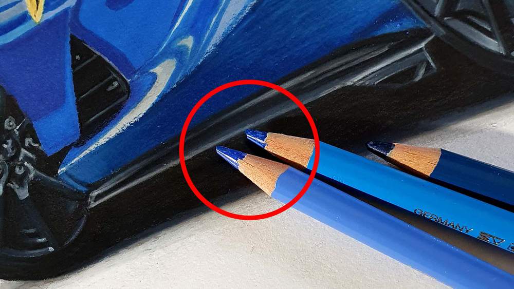
Mistake #6: Not Keeping the Pencil Sharp

A sharp pencil is an artist's ally. While there are times when a blunter tip is desirable, many beginners overlook the importance of maintaining a sharp point on their colored pencils.
Why Is a Sharp Pencil Important?
Detailed Work: Fine details, such as hair strands, fur, or intricate patterns, require precision. A sharp pencil offers the accuracy needed for these elements.
Even Color Application: A sharp pencil allows for uniform color application. Blunt or uneven tips can lead to patchy coloring, making the artwork appear less polished.
Better Pigment Transfer: Sharper tips facilitate better pigment transfer to the paper, meaning you don't need to apply as much pressure to achieve vibrant colors.
Less Paper Damage: With a sharp pencil, you're less likely to inadvertently damage the paper. Blunt pencils require more pressure, which can lead to indentations or even tears.
Tips for Maintaining a Sharp Pencil
Regularly Sharpen: When coloring, keep an eye on the point. When you notice it gets too blunt, sharpen it.
Gentle Sharpening: Turn the sharpener, not the pencil, when sharpening. This method reduces the stress on the pencil and minimizes breakages.
Mind the Length: Don't sharpen the pencil to an extremely long point. This increases the risk of breakage. A moderately sharp point is sufficient for most detailed work.
Maintaining a sharp pencil might seem like a minor aspect of the coloring process, but its impact on the final artwork can be profound. By ensuring your pencils are sharp and ready for action, you give yourself the best tools to produce detailed, vibrant, and polished pieces. A well-sharpened pencil, combined with the right technique, can elevate the quality of your work, making every stroke count.
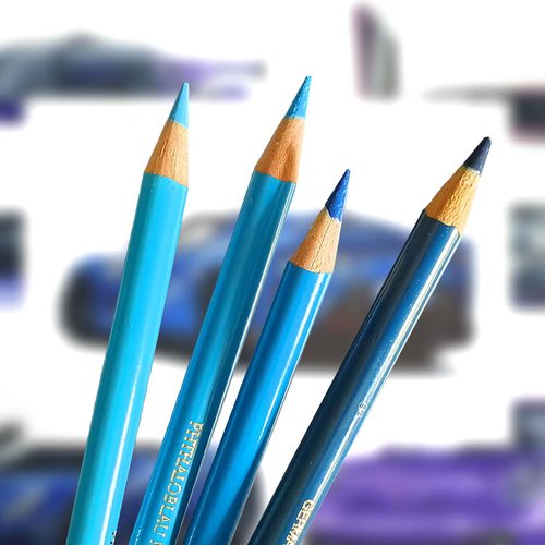
Mistake #7: Not Testing Colors
Jumping straight into an artwork without testing colors can be likened to diving into unfamiliar waters without checking the depth. Color testing is an essential step that many beginners skip, only to find that the chosen colors don't produce the desired effect.
Why Is Testing Colors Crucial?
Actual vs. Barrel Color: The color of the pencil barrel often doesn't match the actual color the pencil produces. Testing prevents surprises in your final piece.
Blending Outcomes: How two or more colors blend together might differ from your expectations. Testing provides a preview of the final blend.
Paper Influence: The type and color of paper can alter how a colored pencil appears. A color might look different on a textured vs. smooth paper or a white vs. tinted paper.
Layering Effects: The result of layering one color over another can vary. Testing these layers beforehand can guide your choices in the main artwork.
Avoiding Mistakes: Discovering midway that a color doesn't work can be disheartening and challenging to correct. Testing minimizes these moments.
Tips for Effective Color Testing
Swatch Charts: Create a swatch chart for all your colored pencils. This reference will help you quickly see how each color looks on paper.
Test Blends: If you plan to blend colors, test these combinations on a scrap piece of the same paper you'll use for your artwork.
Simulate Layers: Apply colors as you intend to in the final piece. If you're planning to layer blue over yellow, test this combination first.
Keep Records: Over time, keep a record of combinations and blends that you like. This personal reference can speed up decision-making in future artworks.
Trust Your Eyes: Sometimes, even if a combination looks good on paper, it might not feel right for the specific piece you're working on. Trust your judgment.
Color testing is like a rehearsal before the main performance. It ensures that you're familiar with your tools and how they'll behave in various scenarios. By investing a little time in testing, you not only safeguard against potential mistakes but also enhance the quality and depth of your colored pencil artworks.
Mistake #8: Relying Solely on Black for Shadows
Shadows are integral to creating depth, form, and realism in an artwork. However, a common misconception, especially among beginners, is that black is the only color to use for shadows. Relying solely on black can sometimes result in flat, lifeless, or unnatural-looking shadows.
Why Is Avoiding Pure Black Often Advised?
Depth and Vibrancy: Black can easily overpower other colors and, when used indiscriminately, can make shadows look flat. A well-thought-out color combination can yield shadows with more depth and vibrancy.
Natural Appearance: In real life, shadows aren't always pure black. They often carry hints of colors from the surrounding environment.
Color Temperature: Shadows can be warm or cool, depending on the light source. For instance, on a sunny day, shadows might carry a bluish tone, while a sunset might cast warmer, reddish shadows.
Harmonizing with the Composition: Using colors that complement or harmonize with the rest of the artwork for shadows can create a more cohesive and visually appealing result.
Tips for Creating Dynamic Shadows
Complementary Colors: Consider using the complementary color of the object's primary color to create shadows. For example, for a predominantly green object, a touch of red can help create a shadow with depth.
Color Layering: Instead of using black outright, layer other colors first, like blues or purples, and then deepen the shadow with a touch of black if necessary.
Study Real Life: Observe shadows in the real world, and you'll notice they carry a spectrum of colors. This observation can guide your color choices.
Practice with Grays: There are various shades of gray|???|cool grays with bluish undertones, warm grays with brownish undertones. Experimenting with these can offer a softer alternative to stark black shadows.
Experiment with Color: Don't be afraid to use unconventional colors for shadows. Sometimes, a touch of purple, blue, or even green can make shadows come alive in unexpected ways.
While black has its place in creating shadows, relying solely on it can limit the richness and depth of your artwork. By exploring a palette of colors and understanding the nature of shadows, you can create artworks that resonate with depth, realism, and vibrancy. Every shadow has a story, and with the right colors, that story can be told in the most captivating way.
Mistake #9: Rushing the Process
Colored pencil art is inherently a slow and meditative medium. The layering, blending, and detailing often require time and patience. However, in the eagerness to see a finished piece, beginners might rush through the process. This haste can lead to a range of issues.
What Are the Consequences of Rushing?
Missed Details: By hurrying, you might overlook intricate details that can elevate your artwork. These nuances often make the difference between a good piece and a great one.
Inconsistent Layers: Proper layering requires a gradual approach. Rushing can result in uneven layers, leading to patchy color application.
Increased Mistakes: Mistakes are more likely when you're in a hurry |???| from choosing the wrong colors to accidentally smudging parts of your artwork.
Limited Depth: Depth in colored pencil art comes from patiently layering and blending. A rushed piece may lack this richness and dimension.
Missed Learning Opportunities: Slow work allows you to understand your tools and techniques better. By rushing, you miss out on these learning moments.
Tips to Embrace a Slow and Steady Approach
Set Realistic Expectations: Understand that a quality colored pencil piece will take time. Adjust your expectations accordingly.
Break it Down: Instead of viewing the artwork as a whole, break it down into sections or elements. Focus on one section at a time.
Take Breaks: If you feel the urge to rush, it might be a sign that you need a break. Stepping away for a while can refresh your perspective and patience.
Enjoy the Process: Instead of just aiming for the finished piece, learn to enjoy the process of creation. The act of coloring itself can be therapeutic and rewarding.
Keep a Progress Journal: Document your progress with photos or notes. Seeing the evolution of your piece can be motivating and a reminder of the journey.
Rushing through your artwork can be tempting, especially if you're eager to see the end result. However, the beauty of colored pencil art often lies in the journey |???| the slow layering, the meticulous blending, and the joy of seeing the piece come alive step by step. By taking your time, you not only produce better artwork but also enhance your skills and understanding of the medium. Remember, art is as much about the process as it is about the final piece. Embrace every moment of it.
Tags
Articles You Might Also Like
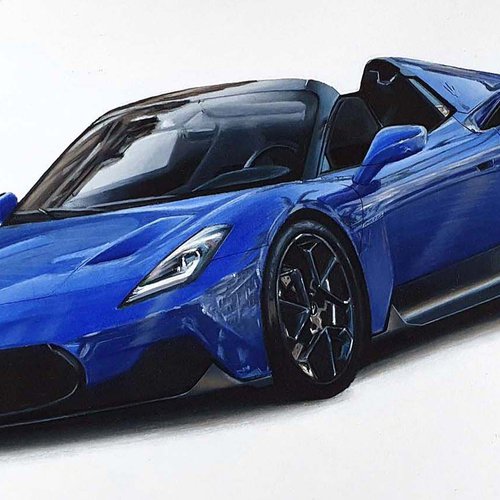
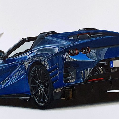

I love bringing cars to life with alcohol markers and colored pencils.
Whether you're just starting out or looking to improve your skills, I'm here to help!
Click here to learn more about me.


Add a comment
Comments
THANK YOU for all your great advice. I am returning to colored pencils after decades of using other media. Your information is greatly appreciated. Did you get your Porsche 911 and Ferrari 812?