10 Common Mistakes When Drawing Cars
When drawing cars there are so many mistakes you can make that reduce how realistic your car drawings will turn out. In this article, we'll cover the 10 biggest car drawing mistakes and I also teach you how to avoid making these mistakes so you can make better car drawings.
Btw, if you're interested, here's a full step-by-step tutorial on how to draw a realistic car.
Let's get started with the first mistake.
What Are Common Mistakes People Make When Drawing Cars?
1. Rushing the Sketch
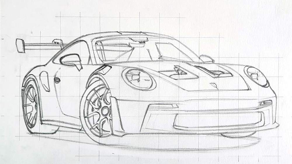
When drawing cars the first mistake people make is rushing the sketch. The sketch serves as the foundation for the rest of your drawings. It is one of the most important parts if not the most important part of your drawing.
In your sketch, you make sure the car's proportions are correct, but you also mark where the reflections are going to be, you sketch all the details of the car such as the grill, but also the interior if it's visible.
So take your time to ensure you've sketched everything before you start coloring. Having a complete sketch makes it so much easier to color it in later.
2. Misjudging the Proportions
Making sure the car's proportions are correct is one of the most difficult parts of your sketch, especially when you freehand it. Honestly, I suck at freehanding a sketch of a car...
But luckily there are many techniques you can use to make it a lot easier to make an accurate sketch. For example, I use the grid method all the time.
By dividing your drawing into many squares it becomes a lot easier to sketch accurately as you can see where body lines intersect with the grid lines and in which square they start.
You can find more on the grid method in this article I wrote.
And if you don't like the grid method, here is a list of more methods that make it easier to get correct proportions when drawing a car.
3. Not Giving the Wheels the Attention They Need
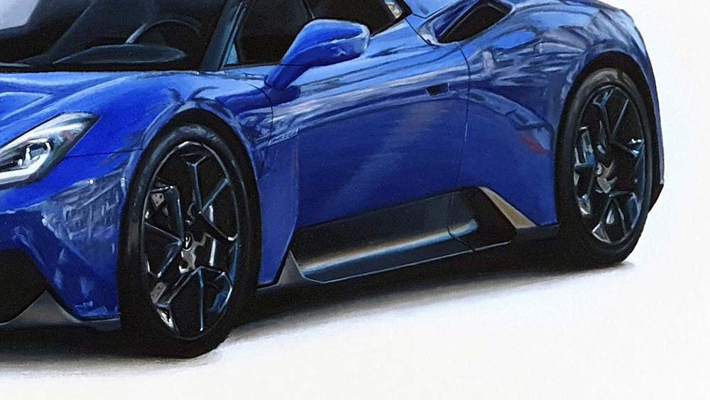
Wheels... They might be the single most difficult thing to draw when drawing a car, but they also have a huge impact on how realistic your drawing will look. So you must give them the attention they need.
It starts by making sure the sketch of the wheels is as perfect as possible. Wheels are ellipse shaped which can be a difficult shape to sketch.
What I do when sketching the wheels is I look where the lines of the wheels intersect the grid and then I mark those spots. Next, I also mark the top, the bottom, the most left, and the most right part of the wheel. After that, I try to connect the dots as smoothly as possible.
Most of the time the shape will look good and not egg-shaped, but sometimes I can't get it right. What I do then is I hold my sketch up in front of a mirror to see if mirroring it makes the error more visible. But if that doesn't work I take a photo of my sketch and overlay it in Photoshop with the photo I'm using for the proportions. This makes it easy to see where my sketch of the wheels differs from the photo.
4. Making the Sketch Too Dark
Making the sketch too dark might result in the sketch lines showing through your drawing, especially if you're drawing a yellow car or a car with a light color.
I'm definitely guilty of this mistake... I've done it too many times and it sucks when it happens as you can't really do anything about it anymore after you've colored over it. So make sure that you erase your sketch lightly BEFORE you start coloring.
Using a kneaded eraser makes this very easy. Just roll your kneaded eraser over your sketch and it'll evenly lighten it enough so it won't show through, but not too much so you can still easily see your sketch when coloring.
5. Not Using the Right Paper for Your Choice of Medium
Using the right paper is another important factor that influences how good your drawing will turn out, even before you've started it.
Through drawing many cars I've learned that you can't just use any paper with any medium. When I use alcohol markers I use paper that works well with alcohol markers and when I use colored pencils I make sure to use paper that works well with the colored pencils I have.
When I use both alcohol markers and colored pencils it depends. If I'm mainly going to use colored pencils and I just use the alcohol markers to block in the colors then I'll use paper that works well with colored pencils. But if I'm mainly going to use alcohol markers and only use colored pencils to add a few details I'll use marker paper.
What paper you should use also depends on the techniques you're going to use. For example, if you're using colored pencils and you're going to blend them with solvent, watercolor paper might actually be better than colored pencil paper.
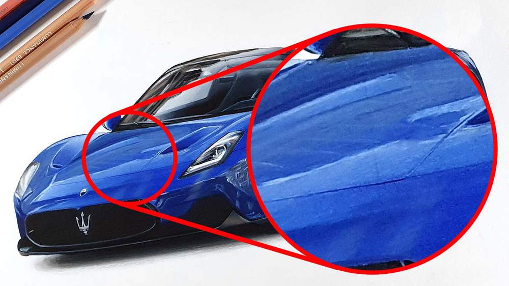
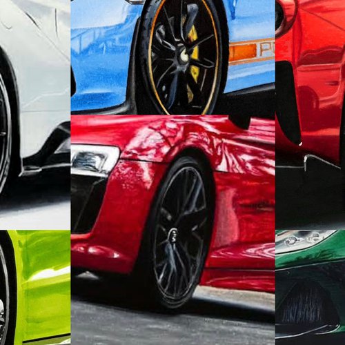
6. Not Taking the Reflections into Account
When I first started out I had never noticed cars had reflections. I would just look at the lighting and shade accordingly. It was only when I wanted to make my drawings look more realistic and used a reference photo for the first time that I saw that the car I was drawing had reflections. Now reflections play a very big role in my drawings.
Reflections take your drawing from looking good to looking very good (when done right). Even if it's just the default reflections of the horizonline.
When drawing a car I always make sure I have a reference photo for the reflections I want the car to have. This makes it easier to make the reflections look good, even if you don't fully stick to the reference, and you can actually see how the reflections follow the body of the car instead of guessing how it might look.
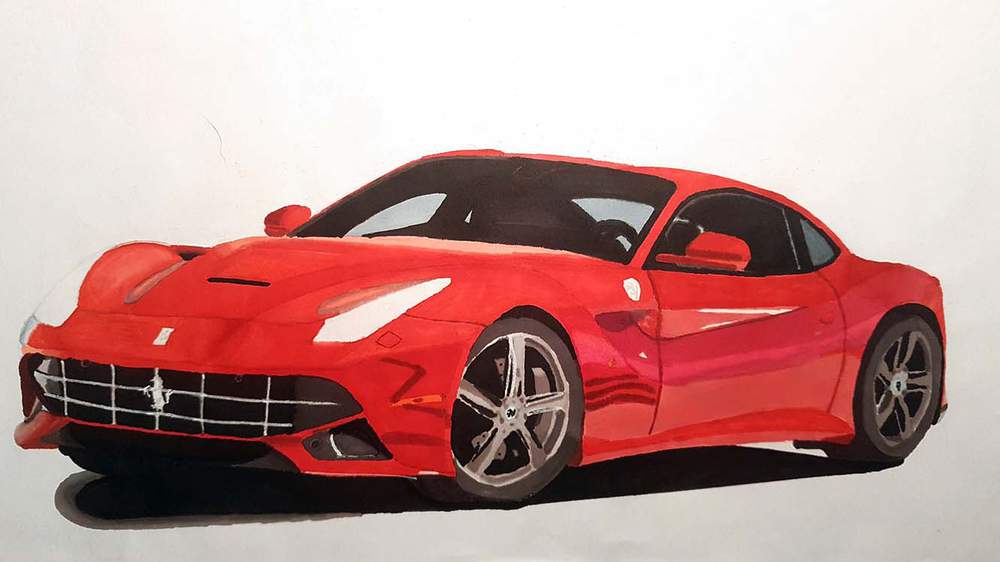
7. Making the Windows Black

Maybe this is just more of a preference of mine, but making the windows black makes the car drawing look so much less realistic, even if the rest of the car is hyperrealistically drawn. Car windows are never fully black, even when they are tinted to the max.
Due to the curvature of car windows, the part of the window that's the furthest away will fade into a lighter color, depending on the environment of course.
Car windows also reflect a lot of the surroundings, especially when parked in a place with tons of buildings or trees.
8. Not Drawing the Shadow

I've always wondered why some people don't draw the shadow when drawing a car. The shadow is what makes it look attached to the ground. Without a shadow, it's almost like it's floating in space.
I get that with certain lighting and looking at it from a certain point of view the shadow might not be visible, but, in my opinion, it would look better if there was just a little bit of shadow showing from under the car.
9. Neglecting the Details
This is another mistake I'm guilty of: neglecting details.
Details can make your drawing a heck of a lot more realistic, but with that also comes a big time investment. Drawing details takes a lot of time, but it's definitely worth it.
Cars really come to life when you spend the time adding the tiny details, but it's not at all necessary to draw them all. I usually skip a ton of details, it at least feels like I do.
Some details are not worth the time in my opinion. For example grills in certain conditions. Grills are often in a dark spot in the car and sometimes the lines are just too tiny to make it look good on a smaller-scale drawing, so I just skip them.
The best part of skipping a few details here and there is nobody will notice, but you can't do this too often otherwise you'll lose some realism.
Experiment with how many details are needed and find a balance between details and time spent on your drawing, well, if you're as impatient as I am. You might also really like drawing details. In that case, go all out.
10. Not Adding Any White Highlights
The last but definitely not least mistake I'll cover today is not adding any white highlights on the car. I'm also guilty of making this mistake.
A few months back there was a period where I didn't think white highlights would make my drawings look better, but looking back at it now I really regret that I didn't add any highlights. My drawings couldn't looked so much better with just a few white details...
Adding a few white sparks on the lacquer of the car makes it stand out a bit more and it makes it look fully finished. But don't overdo it, just add a few here and there.
Articles You Might Also Like


I love bringing cars to life with alcohol markers and colored pencils.
Whether you're just starting out or looking to improve your skills, I'm here to help!
Click here to learn more about me.


Add a comment
Comments
super articles intéressant, bravo et merci Luuk