Porsche 911 991.2 Turbo S Exclusive Series
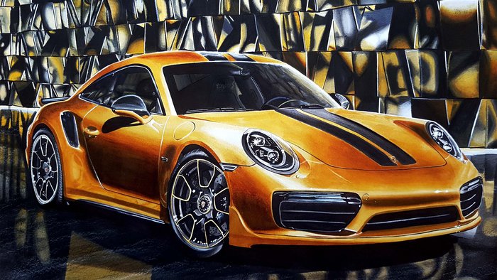
This drawing of a Porsche 911 Turbo S Exclusive Series is the 5th realistic drawing I've made and I finished it around November 2017.
And just like the previous drawing I wrote an article on, this is one of my favorite drawings I've made. But unlike the previous one, I do like this one because of how it turned out and how detailed it is.
This drawing contains so many details that I wanted to capture. Way more than in any drawing I'd made before. That might explain why it took me three weeks (20+ hours) in total to complete.
Materials I Used for this Drawing
To make this drawing I used:
- Winsor & Newton Bleedproof Marker Paper
- Winsor & Newton Promarkers (Y417 Buttercup, Y156 Sunflower, O646 Raw Sienna, IG1, IG2, IG4, IG5, XB and BL Colorless Blender)
- Caran d'Ache Supracolor (White and Black)
- Sakura Gelly Roll (White)
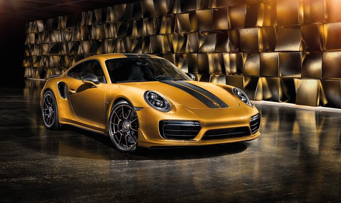
The Reference Photo I Used for this Drawing
My First Post on Instagram
This drawing was the first ever drawing I posted on Instagram (it was even my first post ever...).
One time a friend of mine in high school said: "You should post your drawings on Instagram so I can like them."
And so I did.
I didn't expect much of it as I just had 75 followers (all friends and family).
But once I'd posted it so many people that I didn't know liked it and started following me. And soon I had doubled the amount of followers I had.
I'm so grateful for that as I know it can be very hard to grow an Instagram page if you're just starting out. But also because it kind of jump-started my drawing journey.
This might also have contributed to why I like this drawing so much.
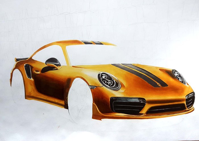
Getting the Right Color
To create this golden color I used a light buttercup yellow (Y417) and sunflower yellow (Y156) for the lightest parts and raw sienna (O646) for the mid-tones.
But I didn't have any marker that was a nice dark-toned gold color, so I had to do some layering.
To get the dark brown gold color I first layered ice grey and then I layered the raw sienna on top. This created a very nice dark golden-brown color that was slightly cool-toned.
I specifically used ice grey as that is a cool-tone grey, so it would make the dark gold color a bit more cool-toned. And I have to say, it turned out really well.
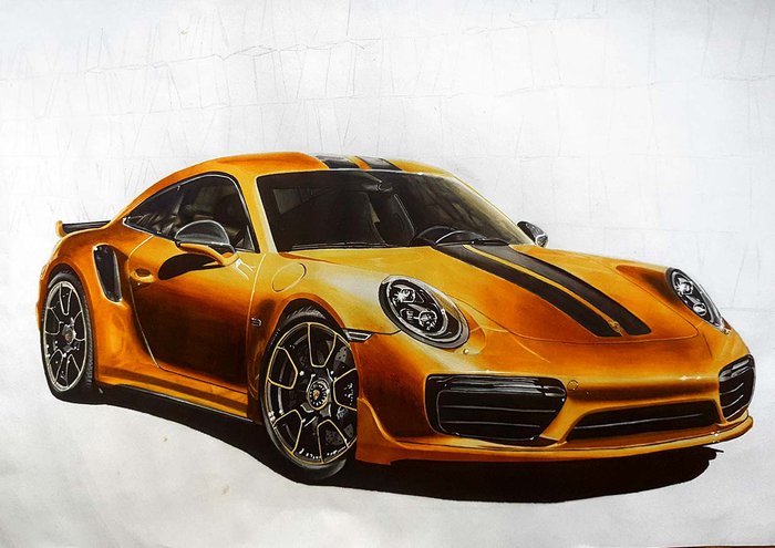
But I did notice something peculiar happening while layering...
The Peculiar Stuff that Happened when Layering a Little too much
At some point when layering all the colors, the paper would just stop absorbing the ink and it would create sticky spots.
But luckily I quickly found a solution for that.
I used my finger to smear it out, but I didn't like that my finger would become sticky and I left ink marks all over the paper. So I had to find something else that I could use to smear it out.
That's when I found a cotton swab which ended up becoming very useful as it easily smear the ink around, but it also absorbed it. This made it look smoother than when I did it with my finger, but it still looked a bit uneven...
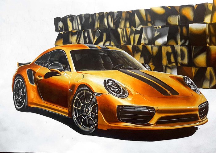
Then Came the Background with its Sophisticated Background Shapes
The shapes in the background took by far the most time.
Each shape needed to be individually colored and quickly blended while the ink was still wet.
But looking at the shapes and how they reflected, was difficult as there's so much going on.
So many lines, reflections, colors, and color transitions.
It was very overwhelming just trying to figure out where I needed to color what color.
And when I thought I'd colored them all, I saw more square shapes that I needed to color. The floor also reflected a few of those square shapes.
But luckily these were easy and quick to draw.
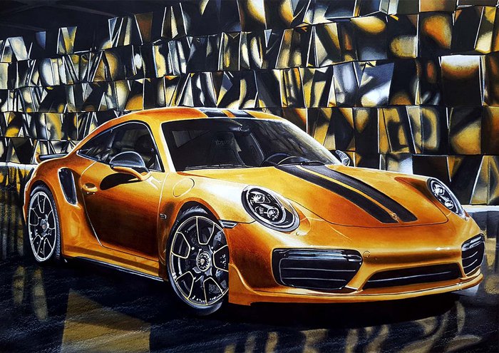
Creating the Ground Texture
In the reference photo, I noticed that the ground had a slight texture to it.
On rougher, more textured paper I could create that texture by just lightly layering black and white colored pencils and the grain of the paper would create the right texture.
But the paper I used was way too smooth for that. So I thought of ways I could get that same texture...
While I did that I noticed that the walls in my room had a rough texture that would be perfectly suited for the ground texture I was trying to make. So I held the drawing against the wall and started lightly coloring the ground with white and then black colored pencils.
It worked out very well.
Adding Highlights
In the reference photo, I also noticed that there were a lot of highlights, especially in the headlights and the wheels. So I bought a white gel pen, the Sakura Gelly Roll to be specific.
And I'm glad I did because it made the drawing look so much better and way more detailed.
I had never before used a white gel pen to create the highlights, I would just leave the areas white that needed to be white. But using a gel pen to add highlights later was so freeing as I could just color over every highlight knowing I could easily add them back in later.
This made the coloring process a lot easier as I didn't need to leave hundreds of tiny white spots for the highlights.
I might have gone a little overboard with the highlights in the end.
Final Result
The drawing turned out very well. And now I think about it it was the first drawing I made with a background. That will also have added to the fact that I like it so much.
The color turned out a bit more orange and more contrasty than in the reference photo, but I like it better that way.
I wish the golden color turned out a little less uneven but it is what it is. I definitely learned a lot from it.
This drawing will always hold a special place in my heart.
Photo Gallery